 Email Marketing Rules
The Savvy, Time-Saving Responsive-Aware Approach to Email Design
 While responsive email design is seeing the highest adoption rate among B2C marketers, responsive-aware may be the savviest and most time-efficient approach to creating a mobile-friendly subscriber experience.
What’s responsive-aware design? It’s an email design approach that uses responsive design for the headers and footers, while using mobile-aware design for the remaining body content. It’s a savvy approach to email design for three reasons:
First, this approach uses responsive design in the portions of an email where the highest link densities and smallest text font sizes are found. Using responsive design to turn an 8-link desktop navigation bar into a much more tappable 3-link one on mobile, for instance, makes the subscriber experience much better. And navigation bar links generally convert at a high rate, so ensuring that they’re easily tappable with a finger is smart business.
Second, header and footer coding is built into your templates, so…
>> Read the full post on Litmus.com

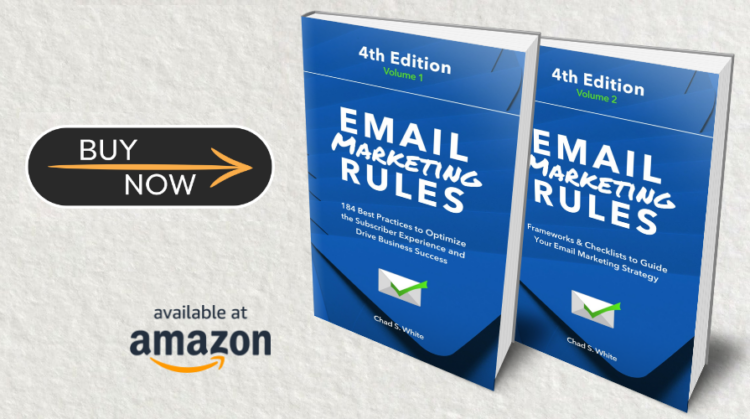
Welcome! Email Marketing Rules is your guide to understanding the best practices of this complex, often misunderstood channel as you craft the best executions for your brand. Every week, we’ll explore strategies and tactics, discuss tips and inspiration, and dig into industry news and trends.
Chad S. White
Head of Research
Oracle Digital Experience Agency
Author of Email Marketing Rules and nearly 4,000 articles about digital and email marketing


Features