 Email Marketing Rules
The Many Gradations of Mobile Email Design
With mobile email reading now beyond the critical mass stage for nearly every brand, marketers are finally making creating mobile-friendly emails a priority. According to a MarketingSherpa survey, it’s an even greater priority than integrating email and social, which I think is very appropriate and overdue.
 My design colleagues here at ExactTarget just released Designing for the Mobile Inbox, a report that gives a great overview of the need for mobile email design and discusses the basics of mobile aware design and responsive design and how they’re different from desktop-centric design.
While it’s helpful to think of email design as falling into those three major buckets, there are actually intermediary steps along the way from desktop-centric design to truly responsive design, and many of the brands I watch are definitely taking intermediary steps:
1. Desktop-Centric Design: Traditional design that’s wide for viewing on desktop and laptop monitors and small links and buttons that are intended for clicking on with a cursor
By my estimation, most marketers are still here at square one.
2. Quasi-Mobile Aware Design: The primary and secondary messages use images and buttons that are mobile-friendly, but the header, navigation bar and footer are still desktop-centric
This is the first step that many marketers take toward being mobile-friendly. Rather than overhaul their entire template, they’re improving the content that changes from email to email. Uncommon Goods is a good example of this approach. Their primary and secondary messages are mobile aware, but their navigation bar and footer aren’t touch-friendly yet.
 3. Mobile Aware Design: A single email design that works pretty well on both desktops and mobile devices
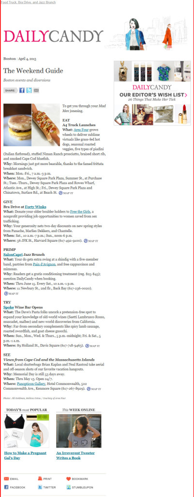
Skinny designs fall into this category. I like the creative approach taken by Daily Candy, which makes the entire right-hand side of their emails expendable in case it’s clipped by a small screen.
Spacious designs—with large images, large type and large buttons—that look good on tablets but scale down nicely for smartphones also fall into this category. Lowe’s emails are a good example of this approach.
4. Fluid, Liquid or Scalable Design: Expanding or contracting to fill the screen size, the design keeps everything on the screen to avoid the need for pinching on touchscreens
 5. Adaptive Design: The design generally uses one or two pixel-width “breakpoints” that correspond to typical screen sizes for smartphones, tablets and desktops to trigger content changes and reformatting so reading the content is optimized for those screen sizes
This flavor of design is often lumped into responsive design, although it’s technically simpler and more predictable in terms of rendering. For instance, we recently called this Starwood email and this REI email responsive when they’re actually adaptive designs with a single breakpoint that converts the email from desktop-friendly to smartphone-friendly. Many marketers will likely never see the need to improve their email designs beyond this point.
6. Responsive Design: The design format and content dynamically changes based on the screen size
This is held up as the holy grail of email design, but there’s very little true responsive design out there in terms of emails. To get a sense of what responsive design can do, just adjust your browser window when reading my blog, which is fully responsive. You’ll see the size of the images and text change dynamically, as well as the content reorient itself, all the way down to a screen width of just 180 pixels.
How mobile-friendly are your email designs currently and which flavor of mobile email design are you aiming for in the future?

Welcome! Email Marketing Rules is your guide to understanding the best practices of this complex, often misunderstood channel as you craft the best executions for your brand. Every week, we’ll explore strategies and tactics, discuss tips and inspiration, and dig into industry news and trends.
Chad S. White
Head of Research
Oracle Digital Experience Agency
Author of Email Marketing Rules and nearly 4,000 articles about digital and email marketing


Features