 Email Marketing Rules
Broadening the Appeal of Mother’s Day, Graduation and Father’s Day Promotions
Posted on January 16, 2014
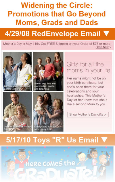 Why pitch your subscribers on buying one gift when you could be convincing them to buy two? A number of retailers have applied this thinking to their Mother’s Day, graduation and Father’s Day messaging in recent years.
In order to increase average order sizes and get sales where they wouldn’t have otherwise gotten, retailers have use two key tactics: They’ve either:
(1) broadened the definition of mom, grad or dad; or
(2) targeted those associated closely with the mom, grad or dad.
>> Read the entire post on the ExactTarget Blog
>> View gallery of email examples on Pinterest
Get Your Burning Email Marketing Questions Answered
Posted on January 7, 2014
 Help us help you. Fellow email marketing book author Simms Jenkins and I want to answer YOUR questions during our All-Star Email Marketing Author Session at the Email Evolution Conference in Miami Jan. 24 at 10:20am.
Not attending? No problem. We’ll be answering some of the questions in future columns and blog posts as well, so please speak up.
>> Submit your own question or cast votes for the questions you want answered most
The Last Word on December 2013
Posted on January 6, 2014
 A roundup of articles, posts, tweets and emails you might have missed last month…
Must-read articles, posts & whitepapers
What’s Your Post-Holiday Email Plan? (MediaPost)
4 Data-Fueled Insights On How People Are Using Gmail’s Tabbed Inbox This Holiday Season (Marketing Land)
Personal @instagram.com email addresses could be part of the app’s new messaging service (Digital Trends)
Big Data & Big Profits: The One Infographic That Will Show You How to Find $200 Billion (LinkedIn)
Insightful & entertaining tweets
@coskier: #emailmarketing RT @LorenMcDonald: At point of unsubscribe @LivingSocial able to salvage 30% of customers with opt-down option #mpeis
@coskier: My experience – avg list had about 75% Inactive. Mgmt freaked out when I said we should purge. Quality beats quantity in my mind. #mpeis
@jacaldwell: #testify RT @History_Pics: 1993 vs 2013: http://t.co/y4PEwX2PtO
@justinpremick: Nice example of relevant, timely #emailmarketing content from @pandora_radio #NewYearsEve pic.twitter.com/UsTSvL5DAm
Great additions to the Swipe File pinboards
Twitter email sent on 12/15/13 >> View the pin
Warby Parker email sent on 11/27/13 >> View the pin
Moosejaw email sent on Moosejaw >> View the pin
Democratic Congressional Campaign Committee’s email opt-out confirmation page >> View the pin
Noteworthy subject lines
Feeding America, 12/31 — Give before midnight tonight
Walgreens, 12/23 — Have FSA Dollars? Don’t lose them, shop now! | 20% OFF Contacts
Furniture.com, 12/29 — Our Top 5 Blog Posts of 2013
Express, 12/30 — Be the hottest girl at the party
Epicurious, 12/25 — Best New Year’s Recipes Ever: Tasty Hors d’Oeuvres, Party Punches, and Day-One Brunches
Morton’s, 12/20 — Count Down to a New Year with Morton’s!
Etsy, 12/20 —3…2…1…
Saks Fifth Avenue, 12/15 — New Year’s Dresses: Countdown to WOW
The Container Store, 12/28 — Make storing Christmas toys child’s play
Nikon, 12/27 — Genuine Nikon accessories for your D-SLR
Target, 12/30 — Fun ways to use that gift card.
Lenovo, 12/27 — Holiday gift cash to spend? Save up to $580 on PCs.
J.Crew, 12/27 — New arrivals: permission to shop for yourself again
Apple, 12/26 — Do a little more receiving.
Aeropostale, 12/26 — Time to Gift Yourself! $5 Tee, $10 Hoodies + Up To 70% Off Everything!
SkyMall, 12/26 — Spend Your Holiday Cash at SkyMall
Monterey Bay Aquarium, 12/19 — Best Fishes and a Happy New Year!
Southwest, 12/24 — Ho-Ho-Hold Onto Your Sleigh, More Low Fares Just Arrived Today. Book Now & Save!
Urban Outfitters, 12/24 — It’s not too late: Get to your local UO Store or Send an E-Gift Card Instantly!
Fossil, 12/24 — Need a last-minute gift? Send a Fossil E-Gift Card
Anthropologie, 12/23 — Our stores are glowing; stop by & warm up!
MAC Cosmetics, 12/23 — There’s still time for Free Overnight delivery!
Daily Candy, 12/21 — Giftable Apps Worth the Thank-You E-Card
Petco, 12/22 — Gift yourself: Buy one $25 eGift Card & get a $5 eGift Card FREE!
Zazzle, 12/22 — Holiday shopping done? Here’s 50% off just for you!
Karmaloop, 12/22 — NEWS FLASH: Santa is Too Drunk to Drive His Sleigh (Save XMas with FREE Overnight Ship + 40% Off)
WebMD, 12/17 — Sick? 10 Tips to Get Through the Day
Subway, 12/17 — Take a break from holiday shopping. Stop in to get your $2 sub! (P&P may vary. $ higher in AK and HI)
Coldstone Creamery, 12/12 — Free Bonus $5 eGift with purchase of $30 or more
Adidas, 12/14 — #adidasmutombo is back in black
Threadless, 12/12 — Adorable with a side of WTF.
Pier 1 Imports, 12/12 — The lights are up, the tree is trimmed—it’s your table’s turn.
The Container Store, 12/11 — Spoiler Alert! We’re on Ellen Today!
Victoria’s Secret, 12/10 — It’s showtime! VS rocks the runway TONIGHT.
Apple, 12/10 — Give an engraved iPad Air. Order by Dec. 11.
J.Crew, 12/10 — A six-letter word for holiday…
Walmart, 12/9 — Green means go! Start saving on Green Monday.
eBags, 12/9 — It’s Green Monday! Hot Holiday Deals + Save 20% Sitewide & Free Shipping!
Toys “R” Us, 12/9 — Green Monday = Savings! Here’s a 15% OFF Coupon!
Uncommon Goods, 12/9 — WARNING: Glitter and Tiny Animals Inside
Wayfair, 12/9 — Holiday hosting made easy? It’s a Christmas miracle
Michael’s, 12/18 — What’s the #1 Gift of the Year?
Wine.com, 12/4 — And our #1 wine is… The Wine.com 100 is here!
Sony, 12/4 — Need Gift Ideas? Check out Our Top Pinned Products
Neiman Marcus, 12/5 — 12 Days of Handbags Sweeps!
Costco, 12/4 — 12 Days of Christmas Deals Start Today! Day 1: Gift Baskets!
Horchow, 12/4 — 12 Deals of Christmas + up to 25% off Decor + FREE shipping sitewide
eBags, 12/4 — 12 Days of Deals Starts Now! Today – Carry-On Luggage – Take 20% Off 1 Item + Free Shipping!
Threadless, 12/5 — Mmmm…Simpsons Tees.
Uncommon Goods, 12/7 — Happy Krampusnacht!
Godiva Chocolatier, 12/3 — RSVP Now: Save 25% when you host a GODIVA Shopping Party!
Walgreens, 12/3 — Our Gift to You: 40% OFF Holiday Photo Cards + New Mobile App Features
Banana Republic, 12/3 — You asked, we listened: Try Reserve in Store today.
American Red Cross, 12/3 — Did you know it’s #GivingTuesday?
Feeding America, 12/3 — How will you give back? #GivingTuesday
Make-a-Wish Foundation, 12/3 — Wish of the Month: Aaron’s Wish + today is GivingTuesday!
ASPCA, 12/3 — Giving Tuesday: Make a Difference for Animals
Earth Day Network, 12/3 — Giving Tuesday: Your Chance to Save the Asian Elephant
St. Jude Children’s Hospital, 12/3 — Be part of Giving Tuesday with gifts that give
J.Crew, 12/2 — Even your boss is shopping today
Dunkin’ Donuts, 12/2 — Free shipping today only, use code FSCYBER
DailyCandy, 12/1 — 14 Post-Tryptophan Pick-Me-Ups
Most popular posts on EmailMarketingRules.com
1. The Many Uses (and 2 Drawbacks) of Animated Gifs
2. Infographic: Email Insights & Trends from Thanksgiving, Black Friday & Cyber Monday
3. My Dreamforce Presentation: The Good, the Bad, and the Best
Dec. 2013 B2C Email Volume Soars: Retailers Sent 25.9 per Subscriber, Non-Retailers 8.8
Posted on January 3, 2014
 During December, retailers sent each of their subscribers 25.9 promotional emails on average, up 26% from November. Non-retailers sent each of their subscribers 8.8 promotional emails on average, up 27% from the previous month.
This data is based on the anonymous tracking for nearly 150 B2C brands, including retailers, restaurants, manufacturers, travel and hospitality, political groups, and nonprofits.
Among both retailers and non-retailers, increases in per subscriber email volume were driven by holiday messaging, kicked off by a high-volume Cyber Monday and Cyber Week. For more on seasonal email marketing trends, check out the Email Marketing Holiday Calendar and this month’s update…
>> Email Marketing Holiday Calendar 2013: December Review & January Preview
The Last Word on 2013
Posted on January 1, 2014
Happy New Year! As we say hello to 2014, I wanted to recap some of the best content from Email Marketing Rules and ExactTarget during 2013.
Of course, it all began with the publication of Email Marketing Rules (paperback/ebook). You can check out the Introduction and an exclusive excerpt for free.
To get you inspired about email design, we launched the Email Swipe File on Pinterest to share outstanding emails. We then built on that by publishing The Best of the Email Swipe File and Holiday Inspirations from the Email Swipe File reports.
Six Email Marketing Predictions For 2013 was my most popular Email Insider column last year, which I followed up on yesterday with An Email Carol: Ghosts Of Predictions Past, Present And Future. I’m also very proud to have been out in front on Gmail Tabs with Why You Shouldn’t Ask Your Gmail Subscribers To Re-Tab Your Emails.
On EmailMarketingRules.com, the two most popular posts were The Many Uses (and 2 Drawbacks) of Animated Gifs and The One-Two Punch of Subject Lines and Preheaders.
And there was plenty of original research as well, including infographics on holiday trends, triggered birthday emails, opt-in failures, and welcome emails. Our most popular one was The Email Marketing Holiday Calendar.
We’ve got a lot of big plans for 2014—some great new research, plus updates to your favorites from 2013. We hope that it will all help you to DREAM BIG in 2014 and accomplish more than you thought possible.
I’m Visited by the Ghosts of Predictions Past, Present, and Future
Posted on December 31, 2013
![]() In my latest Email Insider column for MediaPost, I reluctantly cast myself in the role Emailnezer Scrooge and am visited by three ghosts that hold me accountable for my past email marketing predictions and press me for an assessment of the present and for predictions of the future.
In my latest Email Insider column for MediaPost, I reluctantly cast myself in the role Emailnezer Scrooge and am visited by three ghosts that hold me accountable for my past email marketing predictions and press me for an assessment of the present and for predictions of the future.
>> Read my entire Email Insider column on MediaPost.com
E-Gift Cards Increasingly a Real-Time Gift
Posted on December 27, 2013
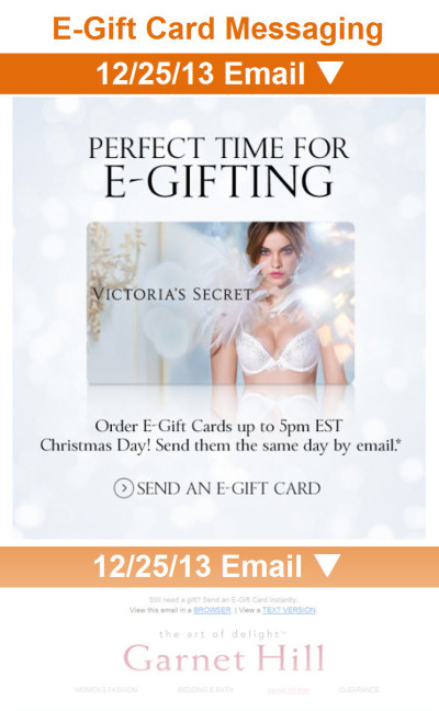 Better delivery technology and the rise of mobile email reading has made e-gift cards, which have long been branded “the perfect last-minute gift,” into more of a real-time gift.
While eGift Card Day is officially on Dec. 23, email messaging about e-gift cards has actually been higher on Christmas Eve since the 2012 holiday season. This holiday season that shift was even more pronounced.
>> Read the entire post on the ExactTarget Blog
>> View gallery of e-gift card messaging examples
Happy Holidays!
Posted on December 25, 2013
On behalf of my family and the entire ExactTarget and Salesforce.com family, I wish you and yours a very merry Christmas and hope that this holiday season has brought you many happy returns!
Chad

Free Shipping Day Waning as Selling Day and Brand
Posted on December 20, 2013
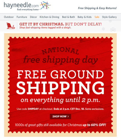 With retailers putting greater emphasis on stretching out the holiday season in recent years, Free Shipping Day has emerged as a major email messaging occasion for marketers. However, this year retailers seem to be cooling Free Shipping Day.
Among nearly 110 major online retailers that we’ve been tracking throughout the holiday season, 77% of them sent at least one promotional email to their subscribers on Free Shipping Day (Dec. 18). That puts Free Shipping Day right between Green Monday (76%) and Thanksgiving Day (78%)—and well below Cyber Monday (88%).
Fewer retailers mentioned “Free Shipping Day” by name, but the day still seemed to inspire retailers to experiment with their free shipping offers.
>> Read the full post on the ExactTarget Blog
Few Retailers Respond to Abandoned Carts on Cyber Monday
Posted on December 17, 2013
 In my second guest column for ClickZ this holiday season (here’s the first), I take a deeper dive into the cart abandonment email research that’s highlighted in our Email Insights & Trends from Thanksgiving, Black Friday & Cyber Monday #Infographic.
On Cyber Monday, ExactTarget clicked through the promotional emails sent that day by more than 90 major online retailers and filled our shopping carts with more than $100 of merchandise. Then we walked away, closing our browser after each shopping session.
Only 21% of those retailers sent a triggered email in response within 3 days. Emails that follow up on shopping carts that are abandoned by subscribers often mean the difference between a completed sale and a lost sale on this high-value shopping day. So the low adoption of shopping cart abandonment emails presents retailers with a wonderful win-win opportunity to serve shoppers better with service and product information and increase their sales.
Our research also uncovered several opportunities to implement these triggered emails better, which I discuss in the column.
>> Read my column on ClickZ.com

Welcome! Email Marketing Rules is your guide to understanding the best practices of this complex, often misunderstood channel as you craft the best executions for your brand. Every week, we’ll explore strategies and tactics, discuss tips and inspiration, and dig into industry news and trends.
Chad S. White
Head of Research
Oracle Digital Experience Agency
Author of Email Marketing Rules and nearly 4,000 articles about digital and email marketing
![]()

![]()