 Email Marketing Rules
Gmail’s New Inbox: Our Take on Tabs
Posted on July 26, 2013
 The inbox is a dynamic place. The latest change comes from Gmail, which debuted its new tabbed interface two months ago and is now nearly done rolling it out to all their users. With every change that comes along, there’s understandable concern by marketers that their efforts will be undermined and, in particular, that their ability to reach their subscribers will be compromised.
To assess the risk posed by Gmail Tabs, a number of us got together and pooled our thoughts and findings under the direction of Al Iverson, ExactTarget’s director of deliverability products. The resulting 4-page whitepaper covers everything you need to know about this new Gmail functionality, including:
- The potential subscriber impact
- How it impacts mobile
- Using branding to your advantage
- What you can do to improve your marketing efforts
>> Download our report on Gmail’s New Inbox
My 15 Minutes with Google Glass
Posted on July 23, 2013
 I recently got my hands on a Google Glass, thanks to intrepid Glass Explorer and fellow ETer Jeff Rohrs, who has already written extensively about his experiences with the wearable device. I wanted to share some of my impressions as well, plus a cross-channel marketing takeaway.
First, this is clearly a beta product. Google Glass is not market-ready. The form factor is clumsy and the navigation is non-intuitive, limited and frustrating. It takes a combination of voice and hand and head movements to fully operate it; navigation can be hijacked by other voices nearby; and the using Glass can make you look pretty ridiculous—Exhibit A: This photo of me.
Second, the apps that it launched with are…
Read my entire post on the ExactTarget blog >>
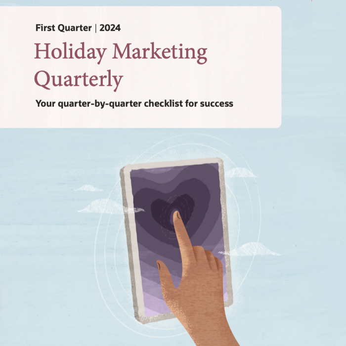
Infographic: 2013 Email Marketing Holiday Calendar
Posted on July 18, 2013
Christmas Day is just a little over five months away!!! That means it’s time to put on your Santa thinking caps and start mapping out your holiday email campaign strategy.
Already the first signs of the holiday season are showing up in inboxes as some marketers deploy their “Christmas in July” campaigns—or the newer “Black Friday in July” and “Cyber Monday in July” campaigns.
To help you with your holiday campaign planning, we’ve created this helpful calendar that for each month includes:
- A projection of the average number of promotional emails retailers will send each of their subscribers
- The portion of that overall email volume that will be holiday messaging
- Common holiday messaging themes
- Key days to be aware of
- And much more.
It Should Have Never Been Social Vs. Email
Posted on July 16, 2013
![]() Email marketers have endured years of misguided “email is dead” rants from folks whom believed social was superior, but it appears that the script has been flipped. Increasingly, headlines like Email Is Crushing Twitter, Facebook for Selling Stuff Online, Why Email Punches 100x Above Social Media and Stores Seeking Shoppers Find Email Outdraws Facebook are the norm.
Email marketers have endured years of misguided “email is dead” rants from folks whom believed social was superior, but it appears that the script has been flipped. Increasingly, headlines like Email Is Crushing Twitter, Facebook for Selling Stuff Online, Why Email Punches 100x Above Social Media and Stores Seeking Shoppers Find Email Outdraws Facebook are the norm.
It’s looking more and more like social—after reaching the Peak of Inflated Expectations with Facebook’s IPO—has plunged into the Trough of Disillusionment a la Gartner’s Hype Cycle. While I’m not immune to the schadenfreude of the role-reversal and appreciate that folks are acknowledging email for the sales powerhouse that it is, it has become abundantly clear that email vs. social was never a fair matchup.
Email and social each excel at communicating with consumers at different points in the sales funnel and for different purposes. Email vs. social makes no more sense than…
>> Read my entire Email Insider column on MediaPost.com
Happy Birthday to Me, a Free Book for You
Posted on July 15, 2013
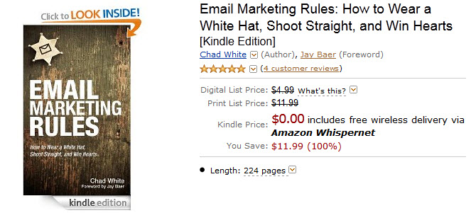 Today is my birthday! Besides being spoiled by my wonderful family, it’s a day when I tend to reflect on what I’ve accomplished over the past year and think about my goals for the next.
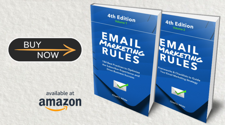
My biggest accomplishment over the past year has been the publication of my first book, Email Marketing Rules, which I’m tremendously proud of. And my goal for the next year is to get it into as many hands as possible, especially the hands of those who are new to email marketing.
To that end, today I’m giving away the Kindle Book edition of Email Marketing Rules for free. Just visit Amazon.com to download the book and get the free Kindle Reader app so you can read it on any smartphone, tablet or computer. Please help spread the word. (Apologies to my UK readers, as this offer isn’t available there for some reason.)
I hope you enjoy it and that it helps you identify opportunities where you can improve, serve your customers better and be more successful. Whether you love it or merely like it, I also hope that you’ll share your thoughts on it by submitting a review on Amazon.
Thanks for your readership and support,
Chad
Watch “The 5 Design Trends behind ‘The Best of the Email Swipe File'” Webinar
Posted on July 12, 2013
If you missed the webinar that Andrea Smith and I did yesterday on “The 5 Design Trends behind ‘The Best of the Email Swipe File,’” the slides (with notes) and a recording of the 45-minute webinar are now available.
View the slides on SlideShare >>
Watch the webinar recording (registration required) >>
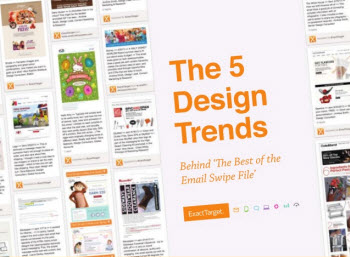
“The Best of the Email Swipe File” is not just about 20 outstanding emails. It is also about five critical design trends:
1. A growing requirement to be mobile-friendly
2. Increasing relevance through personalization
3. Greater sophistication for triggered messages
4. A stronger editorial voice
5. A continued evolution of inspired fundamentals
During this webinar, Andrea Smith and I discuss these trends and how our selections from the Email Swipe File illuminate those trends.
The Long and Short of Progressive Profiling
Posted on July 9, 2013
Data is the fuel for all targeted and tailored messaging. Getting good information is the tricky part. The best sources of intel comes directly from your subscribers. Much can be inferred by your subscribers’ purchases, browsing and other interactions with your brand, but there’s also value in asking your subscribers directly about their contact information, interests, demographics and other characteristics.
This is known as progressive profiling, since you build a better profile of a subscriber over time. Since the most efficient email signup forms are very short, there’s a need to build out a view of the subscriber by collecting information at checkout, through surveys and other data requests.
When doing progressive profiling, it’s important to separate data with long-term significance from data that’s only useful in the short-term.
Long-Term Data
Birthdate, gender, number of children, zip code, broad interests—this kind of information never changes or is unlikely to change over the course of a multi-year email relationship. These data points are great to collect early on.
 For instance, the second email in Zulily’s welcome email series asks new subscribers what their favorite brands are so the retailer can alert them to deals on the brands. And last month, when they added UGG as one of their suppliers, Zulily sent a June 4 email that asked subscribers if UGG was one of their favorite brands. Zulily clearly sees tremendous value in being able to send targeted messages about brands their subscribers care about.
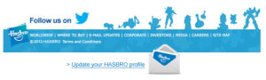
 While some brands send dedicated emails requesting that subscribers update their preferences, it has become more common for brands to build an “update your preferences” request into their email template, like Hasbro does in their footers. It’s also becoming increasingly common to use a preference center as your opt-out page, like Jetsetter does, since giving a dissatisfied subscriber the power to reduce how many emails they receive and select topic preferences reduces unsubscribe rates.
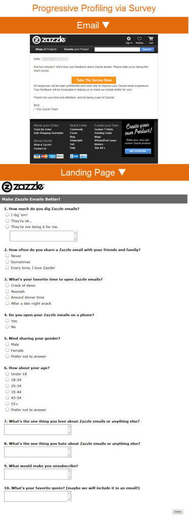
You can also collect preferences and profile data through surveys and polls. For example, a June 16 email from Zazzle asked subscribers to help improve their emails. That survey included some demographic and email interaction questions that could be used to directly improve the content, format and timing of emails to the individuals that complete the survey.
Short-Term Data
While broad, long-term information can be highly useful in targeting, short-term data can be very useful as well because it can be more pointed.
 For instance, in a Mar. 13 email, Lowe’s asked subscribers what kinds of home improvement projects they had planned for the spring. The responses allowed Lowe’s to respond with segmented emails sent to those who responded, providing special offers that matched up with their spring projects. Those responses were only useful for a few weeks and won’t be useful next spring, but allowed Lowe’s to send more relevant emails in the near term.
Similarly, Harry & David polled their subscribers about their Thanksgiving plans in a Nov. 8, 2011 email. They then followed up in a subsequent email with the results of the poll, as well as suggestions for entertaining essentials for those who are hosting and suggestions for host and hostess gifts for those that are traveling for Thanksgiving.
Whether you’re going after long-term or short-term information, be sure that you make it super easy for subscribers to share information with you. The more you ask of your subscribers and the harder you make it for them to help you, the more they’ll abandon the process and be hesitant to respond in the future.
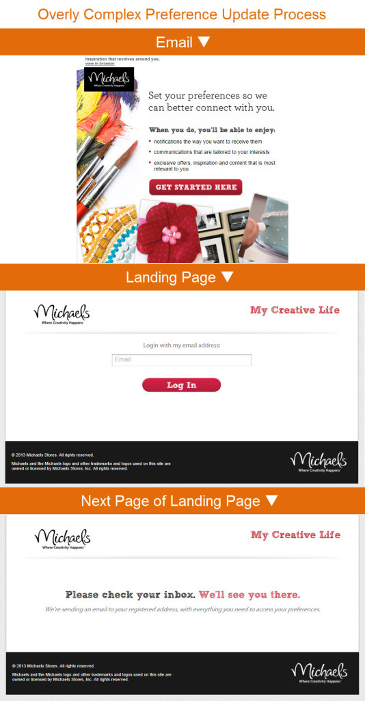
For instance, Michael’s recently emailed a preference update request. When you click through, rather than taking you directly to a preference center, it takes you a page asking for your email address. When you enter your address, that still doesn’t take you to a preference center, but rather simply tells you that they’ll send you an email with “everything you need to access your preferences”—which sadly I never received. That’s a lot of effort to yield nothing in the end for either party.
The Last Word on June 2013
Posted on July 2, 2013
 A roundup of articles, posts, tweets and emails you might have missed last month…
Must-read articles, posts & whitepapers
The Cost of a Subpar Email Campaign (Multichannel Merchant)
Mobile Is Eating The World (AVC)
Gmail for Android 4.5 – First Impressions – Part One (BrightWave Marketing)
Bonobos & Email Aptitude Part III: Building a Robust Opt-Down Strategy (Email Aptitude)
Majority of Americans support phone tracking, oppose email spying, says Pew (The Verge)
Three Reasons We’ve Outgrown Mobile Context (UX Matters)
5 Over-hyped Retailer Trends Miss the Mark with Shoppers (RIS News)
How Scentiments.com doubled its revenue per e-mail (Internet Retailer)
Insightful & entertaining tweets
@ryanpphelan: Wow, the rolled out the new gmail fast for iPhone. #emailmarketing http://t.co/0aEoOje6uZ
@litmusapp: @amandaberkey We found that just 3.3% will open on more than one device. Mobile triage is a myth: http://t.co/LIBO43NeuO #ETCafe
@meladorri: .@PizzaExpress does some neat image blocking defense. Not mobile friendly, though! #ETCafe https://t.co/FEF9G1gzZI
Great additions to the Email Swipe File pinboard
Anthropologie email sent on 6/11/13 >> View the pin
Sony PlayStation New Zealand email sent on 4/20/13 >> View the pin
Banana Republic email sent on 5/9/13 >> View the pin
Noteworthy subject lines
Wine.com, 6/30 — Our most popular American wines for July 4th! What will YOU be drinking?
Brooks Brothers, 6/29 — Our Made in America Shop – Save up to 50%
Lowe’s, 6/30 — Is Your Backyard Ready for the Big Bash?
Clinique, 6/30 — Safe is sexy: Top sunscreen tips.
Home Depot, 6/28 — Big Savings & Big Fun – We Started Without You!
SkyMall, 6/24 — Longer Days Deserve Longer Sales
Zulily, 6/21 — ☼ Summer starts now! ☼
ModCloth, 6/12 — Here comes the ☼-dress!
Toys “R” Us, 6/30 — Smart Savings on Back-to-School Needs!
ASPCA, 6/30 — USDA Approves Horse Slaughterhouse–You Can Stop It!
Lenovo, 6/27 — Out of Office?
Ann Taylor, 6/24 — POWER Pieces = SMART Investment
Adidas, 6/20 — The right amount of retro
Neiman Marcus, 6/19 — The Pointed-Toe TREND #NMshoelove
Subway, 6/13 — 6+21=4. The $4 Lunch adds up! (At participating restaurants. Pricing details inside.)
Zazzle, 6/13 — Help us improve Zazzle emails with this short survey!
GOP.com, 6/12 — #41 Turns 89!
Sears, 6/12 — Don’t overthink. Just open.
Urban Outfitters, 6/12 — OH SHIP! Free Shipping Ends Today!
Barneys New York, 6/11 — Love Dad: Shop Father’s Day Picks from Tyson Chandler, David Neville, and Greg Chait
West Elm, 6/10 — He’ll never know you waited…
Brooks Brothers, 6/10 — Father’s Day Shipping Deadlines
Moosejaw, 6/10 — Dads Like Free Hottie Posters
Uncommon Goods, 6/6 — 25 Ways to Make a Grown Man Cry
Dunkin’ Donuts, 6/6 — Free Donut on June 7th in honor of National Donut Day
Lenovo, 6/5 — The new look of Lenovo.com
Zulily, 6/4 — UGG® Australia starts Thursday on zulily
Most popular posts on EmailMarketingRules.com
1. 9 Ways to Get Subscribers to Scroll
2. Check Out the Curves on These Emails!
3. The 1, 2, 3 of Defensive Design
4 Examples of Swipe Files in Action
Posted on June 27, 2013
A swipe file is a record of your top-performing subject lines, emails and landing pages that you return to for learnings and inspiration. Every brand should keep one.
To demonstrate how a swipe file can be used, I’m going to share examples from four brands that clearly keep good records and return to them to make improvements or to extend a concept.
Norm Thompson’s Christmas stocking emails. Back on Dec. 10, 2007, Norm Thompson sent a skinny email that uses the image of a Christmas stocking to entice you to scroll, which exposes you to various gift links along the way and culminates in a ginger bread man call-to-action. At the time, skinny emails were novel and really stood out since they were about half as wide as the average email in your inbox.
Over the next five years, Norm Thompson returned to the email creative each year, using the same overall design and tweaking the headline, gift links and call-to-actions. And, of course, over that time skinny emails became much more common as marketers have tried to make their emails more mobile-friendly.
Sony’s CES emails. This electronics-maker has been promoting their presence at the Consumer Electronics Show for many years now. Their 2008 CES email focused on providing show announcements via SMS and their blog. Their 2009 and 2010 emails were more focused on promoting particularly products, and then video and social media interaction became the focus after that. The strategy for the emails changed over time and the advent of new social platforms certainly played a big role in those decisions.
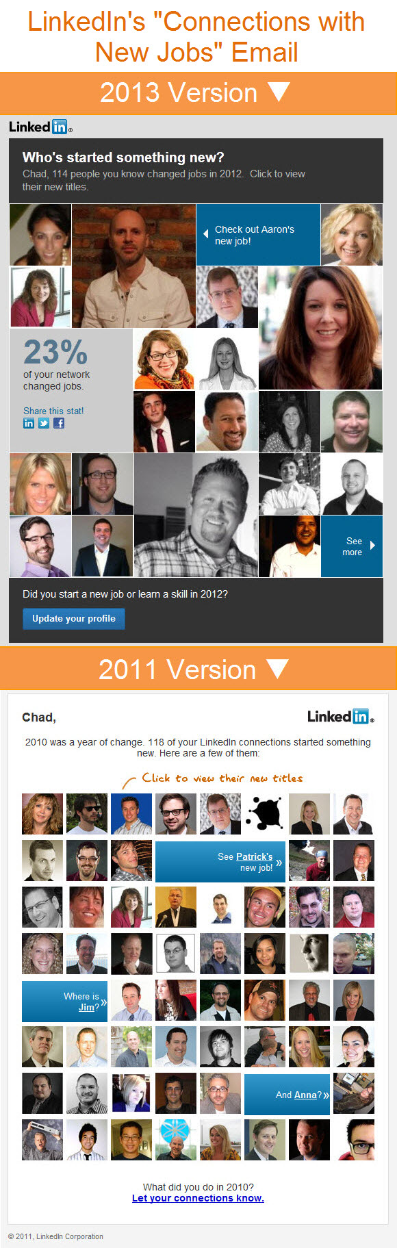
LinkedIn’s “Connections with New Jobs” emails. In January of 2011, LinkedIn sent their first email that updated you on how many of your connections changed jobs in the previous year. The email was really a breakthrough in personalization. Not only did they crunch the numbers on how many of your connections changed jobs, but the email was built from a selection of their profile pictures, each with alt text stating their name. Seriously impressive back then.
This year LinkedIn tweaked the delivery, using some larger pictures, calculating a percentage, adding a share-with-your-network call-to-action, and a call-to-action to update your own profile. This latest iteration goes beyond the informative nature of the 2011 email and focuses much more on driving action.
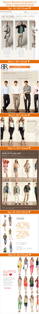
Banana Republic’s model cropping emails. While the Norm Thompson, Sony and LinkedIn examples were of a particular email being modified and improved over time, you can also use your swipe file to refine concepts. Banana Republic has done this with the concept of cropping model images. This technique creates a visual call-to-action to click through in order to see the full image, as people are naturally curious to see the entirety of something that’s partially concealed.
Banana Republic first started using this technique back in a Feb. 16, 2010 email. They’ve since explored variations on it in at least five other emails. While they’ve cropped models mostly on the right side of the email design, which I would expect to create the strongest click incentive, they’ve also experimented with a cropping on the left and top and bottom. With something like this, it’s hard to know for sure until you test it.
I hope this has inspired you to dive back into your past campaigns and look for winning emails and concepts that are worth remaking and further experimentation.


Minimalism Trend in Email Design
Posted on June 25, 2013
 Mobile is driving big changes in email design and one of the niche developments is a trend toward minimalism. Emails contain fewer messages, and those that remain are getting simpler, shorter, and more image-driven.
In The Best of the Email Swipe File, we represent this trend with a Kickstarter email that consists of a logo, headline, three sentences, a call-to-action, and nothing else. This Tumblr email and this Meetup email are also great examples of this trend toward minimalism.
These emails are focused on piquing a subscriber’s interest to earn that click. They leave all the heavy lifting in terms of details, pricing, etc. to the landing page. In some cases, the landing page is extremely rich and detailed, as is the case with the Kickstarter example. So it’s not so much that email is being dumbed down as that content is shifting out of emails and more onto landing pages.
Emails as Window Shopping
This trend is also present in longer emails in the form of minimalistic product grids. In the past, these were often 4-column-wide grids that consisted of a product image and text that included product name, brand, price and other information.
But in the name of mobile-friendliness, now images sometimes stand alone without any supporting text. For instance,a May 23 Crate & Barrel email had a promotion for outdoor pillows that was supported by a 4-by-5 grid of pillows. And a June 4 Banana Republic email promoted a collection of Father’s Day gifts with a headline and some copy that was followed by a bunch of product shots from the collection with no names or prices.
At the same time, product grids have shrunk down to just two columns in many cases—and in a few cases just one column. For example, a June 11 Lululemon email used a 2-column grid with occasional subheadings. And a Mar. 4 Levi’s email uses a simple 1-by-2 grid that shows a model in full attire to support the primary message.
While not true in every case, a number of the product grids in these emails aren’t truly product grids at all because all of the images in the grid all link to the same landing page—whether it’s a product category, seasonal or brand collection, or a gift assortment. It’s worth testing these to see if a link to a collection is truly better than linking to individual products, since the latter puts the subscriber one click closer to buying the product.
Particularly if you’re a brand that’s not built on price, I urge you to give this new approach a try. Your subscribers—which are your most loyal customers—are already familiar with your price points, so why not keep the focus instead on what your products look like and other on brand imagery?

Welcome! Email Marketing Rules is your guide to understanding the best practices of this complex, often misunderstood channel as you craft the best executions for your brand. Every week, we’ll explore strategies and tactics, discuss tips and inspiration, and dig into industry news and trends.
Chad S. White
Head of Research
Oracle Digital Experience Agency
Author of Email Marketing Rules and nearly 4,000 articles about digital and email marketing
![]()

![]()