Things I Would and Would Not Apologize For
Posted on May 23, 2013
Considering the complexities and high volume of our industry, mistakes are practically unavoidable. But just because you’ve made a mistake doesn’t mean an apology email is necessary.
Most brands won’t send a single apology email over the course of a year, and in recent years less than one-tenth of one percent of email volume is apologies for email mistakes. To say that apology emails are rare is an understatement.
When considering whether to send an apology and correction, remember that most of your subscribers will not have seen the email with the mistake in it. So apologizing draws additional attention to the error and sending that additional email may lead to annoyance and more unsubscribes.
With that in mind, here are some mistakes that I would not apologize for:
 Formatting errors: An ugly, broken-up email is a reminder to be more diligent with your coding and do pre-send rendering testing, but not a cause for an apology. Just a couple of days ago Costco sent an email where their 3-column-6-row product grid broke, becoming a 1-column-18-row grid. They smartly let it go and moved on.
Typos: Unless the typo is in your coupon code or creates a profane word, it’s good to let these go as even subscribers who read the email may not notice them or will be able to figure out what you meant using sentence context. Typos in subject lines are not a special case—let those go too.
For instance, on Cyber Monday in 2011, Linens-N-Things had the following typo in the subject line of their third email of the day: “Last Chance: Cyber Monday Deals End in 60 Miutes”. They responded 2 hours later by sending an apology email—their fourth email of the day—with this subject line: “Oops! Sorry for the Typo: Cyber Monday Deals End in Minutes!” On the highest-volume day of the year, this was an ill-advised risk.
Deployment misfires: Sending out an email at the wrong time, especially with missing content, is painful and potentially embarrassing. But even these are worth letting go in most cases.
For instance, in 2007, Drs. Foster & Smith sent out a “Happy Thanksgiving” seasons greeting email a full week early. They didn’t send an apology or resend it the following week. They just let it stand as an early seasons greeting.
And earlier this year, Amazon.com accidentally sent out an email promoting BCS championship gear 24 hours before the game was to take place. They sent an apology, but it was really unnecessary as it was clearly an error to those most likely to buy the gear. They should have just sent the email after the game as planned and in the meantime used the landing page to make it clear that championship gear would be available at the conclusion of the game “tomorrow.”
All that said, here are the three email mistakes that would cause me to send an apology:
1. An email error that seriously impairs the message, such as the wrong coupon code for the primary message or mistakes in the critical links in an email.
 2. An email accidentally sent to the list of a sister brand. Permission is sacred. Accidentally violating it is worth apologizing for and making it clear that they won’t receive any more messages from the sister brand—with the subtext being, “Please don’t mark that email as spam.”
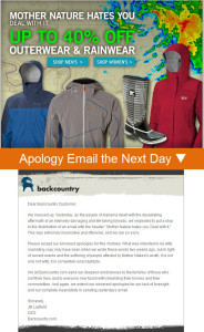
3. An email that was unintentionally offensive. For example, in 2011, Backcountry.com sent an email with the headline “Mother Nature Hates You. Deal with It.” That email was sent on the same day that lethal tornadoes devastated Alabama. Backcountry wisely sent an apology, explaining themselves and saying they were wrong in no uncertain terms.
I hope you’re able to avoid an apology-worthy email mistake, but it’s a good idea to have a contingency plan in place and an apology email drafted, just in case.
Once Again, I Double-Dog Dare You!
Posted on May 21, 2013
 In 2008 and 2010 I double-dog dared marketers to experiment with some little-used, out-of-the-box, perhaps even weird tactics. Some of those tactics are not so uncommon anymore while others are just as rare as they ever were.
Since it’s been more than three years and email marketing is all about experimentation, I think we need some fresh dares. So here we go. I dare you—no, I double-dog dare you!—to… Read my entire Email Insider column >>
Email Marketing Rules Is Now on Pinterest
Posted on May 20, 2013
You can now find every image posted on EmailMarketingRules.com on Pinterest. Just visit the Email Marketing Rules pinboard or click on any image in any of my posts and you’ll be taken directly to the pin on Pinterest.
Also be sure to check out ExactTarget’s other pinboards including:
Email Swipe File
Facebook Swipe File
Infographics!
…and many more.
Happy pinning!
Join My Webinar on Email Marketing Best Practices on May 28
Posted on May 15, 2013
The Good, the Bad and the Best: Practices for a Post-Wild West Email Marketing World
 Adopting email marketing best practices isn’t about ticking boxes. It’s about execution. Join me on Tuesday, May 28, 2013 at 2:00 p.m. (EDT), as I discuss a variety of best practices and share real-world examples of brands with good, bad and the best executions. Topics to be covered will include signup forms, welcome emails, mobile-friendly emails, preheaders, personalization, unsubscribe pages, and more.
‘Email Marketing Rules’ Now Available in Paperback with Foreword by Jay Baer
Posted on May 13, 2013
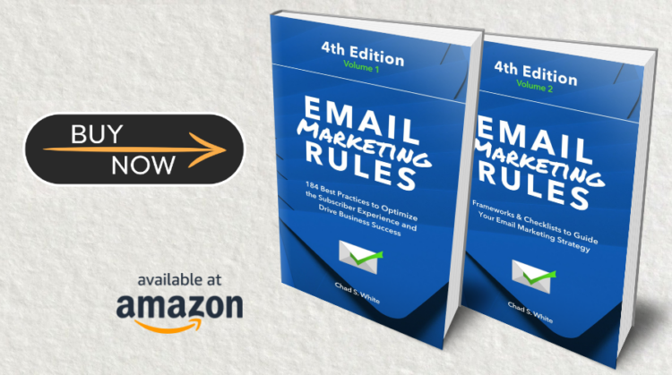
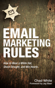 My book on email marketing best practices, Email Marketing Rules, is now available in paperback with a Foreword by Jay Baer, the President of Convince & Convert, author of Youtility, and co-author of The NOW Revolution. Jay is that rare individual that understands how social media, email marketing and content marketing all work together. I am honored to have him write the foreword, where he discusses the currency of modern marketing.
I am also happy to announce that for every paperback purchased through Amazon.com’s CreateSpace I will donate $1 to the ExactTarget Foundation to support projects and programs that reduce childhood hunger, improve education, and spur entrepreneurship. To learn more about the Foundation’s work, please visit ExactTargetFoundation.org.
![]() BUY THE KINDLE BOOK ($4.99) >> available exclusively around the world through Amazon.com. (Download the free Kindle Reader app to read it on any smartphone, tablet or computer.)
BUY THE KINDLE BOOK ($4.99) >> available exclusively around the world through Amazon.com. (Download the free Kindle Reader app to read it on any smartphone, tablet or computer.)
 BUY THE PAPERBACK ($11.99) >> $1 is donated to the ExactTarget Foundation for every book purchased through Amazon.com’s CreateSpace
Infographic: The State of Welcome Emails
Posted on May 3, 2013
To determine the current state of welcome email programs, ExactTarget examined the welcome emails of more than 160 B2C brands, including retailers, restaurants, manufacturers, travel and hospitality, and nonprofits. The infographic below summarizes our findings.
For more on this research, including examples of welcome emails, check out More Brands Sending Welcome Emails, But Opportunities Remain and Quarter of B2C Marketers Send a Welcome Email Series.
Want this infographic for your blog? Here is the code you can use:
The Last Word on April 2013
Posted on May 2, 2013
 A roundup of articles, posts, tweets and emails you might have missed last month…
Must-read articles, posts & whitepapers
Nine email marketing tricks that earn eBags $14 a head on email subscribers (Smart Company)
Subscribers, Fans, & Followers: 2013 Global Executive Summary (ExactTarget)
66% of marketers say email delivers ‘excellent’ or ‘good’ ROI (econsultancy)
Just how engaging are birthday emails? (Return Path)
SaleCycle Look Book (SaleCycle)
An apparel retailer converts 33% of one-time buyers into repeat shoppers (Internet Retailer)
Remailing: It’s Like Printing Money! (Bronto Software)
Updating Email Acquisitions? Focus Further Down The Funnel (MediaPost)
Insightful & entertaining tweets
@andrewkordek: just got done prioritizing taguchi test factors for a client. Love it that we can test over 18,000 things in email #emailmarketing
@EmailSeinfeld: Kramer invents Scent-in-Email: “It’s like having the beach, right in your inbox.” Elaine’s bf (@chadswhite) says her subject lines are weak.
@EmailStatCenter: 50% felt getting their name wrong in an email was a reason to think less of the brand. – @Emailvision http://t.co/LgBHuwVkJ9
@aliverson: Hey “email expert,” your email’s going to spam because you messed up your DMARC record.
@JustinBridegan: Don’t be afraid of long subject lines, be afriad of words without meaning. Clarity is the key #ETcafe #emailmarketing
Great additions to the Email Swipe File pinboard
Litmus email sent on 4/23/13 >>View the pin
Tumblr email sent on 3/6/13 >>View the pin
Jack Spade email sent on 3/21/13 >>View the pin
Sephora email sent during 3/2013 >>View the pin
Noteworthy subject lines
Karmaloop, 4/30 — What? We Are Not F’n around 40% Off Footwear- 48 Hours
Etsy, 4/27 — Watch Your Language!
Gap, 4/29 — 1 dress, 4 ways to wear it
Crate & Barrel, 4/29 — Chop chop. Up to 45% off Wusthof Gourmet knives.
Restoration Hardware, 4/27 — Introducing RH Small Spaces. 116 Pages of Inspired Design.
ThinkGeek, 4/25 — ThinkGeek: F5, F5, F5!
The North Face, 4/22 — Opt for Recycled Gear this Earth Day
Uncommon Goods, 4/22 — Re-Make a Difference
Boston Market, 4/11 — The Big Rib-bate: Two Rib Meals for $10.40!
Brooks Brothers, 4/11 — An Interview with Wynton Marsalis
Threadless, 4/10 — These new Iron Man tees will not give you super hero powers… or will they?
The Container Store, 4/8 — Ever wonder why we have so many hangers?
Clinique, 4/4 — BB or CC? Find your skin perfector and we’ll ship it free.
Home Depot, 4/4 — Black Friday Is Back! Savings Start Today!
Zappos.com, 4/4 — Puddles Beware!
ModCloth, 4/3 — Retro looks you can wear during your next time warp.
Ninety Nine Restaurants, 4/3 — Our New Menu is Here!
Ann Taylor, 4/3 — NEED. WANT. MUST-HAVE.
West Elm Market, 4/1 — No green thumbs needed…
Most popular posts on EmailMarketingRules.com
1. Yahoo Mail Hacking Reveals Do-Not-Reply Failures
2. Email Signup Failures at Crisis Levels
3. The Many Gradations of Mobile Email Design
 Email Marketing Rules