 Email Marketing Rules
Crowd Favorites from the Swipe File: May 2014
Posted on June 11, 2014
 We pin tons of inspiring digital marketing examples to our Swipe File pinboards on Pinterest every month. And each month you tell which ones most inspired you by repinning and liking them.
Here are your favorite pins among the ones we uploaded last month:
The Email Swipe File’s crowd favorite was…
Pizza Express >> Valentine’s Day email with awesome images-off rendering >> View the pin
>> Browse the Email Swipe File
The Social Swipe File’s crowd favorite was…
Target >> community curation of a party planning Pinterest board >> View the pin
>> Browse the Social Swipe File
The Audience Growth Swipe File’s crowd favorite was…
Uncommon Goods >> post-purchase page asks for social sharing of purchase >> View the pin
>> Browse the Audience Growth Swipe File
Help determine this month’s crowd favorites by repinning and liking the Swipe File pins that inspire you most.
The Last Word on May 2014
Posted on June 3, 2014
 A roundup of email marketing articles, posts, tweets and examples you might have missed last month…
Must-read articles, posts & whitepapers
Gmail Data Analysis Reveals Image Blocking Affects 43% of Emails (Litmus)
Users Receptive To Social Logins, Marketers Slow To Adopt Them (MediaPost)
Gmail’s message to email marketers: Focus on engagement (Campaign Monitor)
Email deliverability issues hurting consumer interaction (Experian)
Defining Your Key Performance Indicators (MediaPost)
Insightful & entertaining tweets
@jwatton: Laser-like demographic targeting. Question is, how did they know? 😉 http://t.co/Lys4yd17Sa
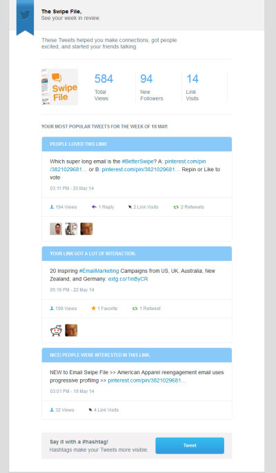
@ETswipefile: Which super long email is the #BetterSwipe? A: http://t.co/u4dhoh8VwV or B: http://t.co/KiQHMRAirA Repin or Like to vote
@salesforce: Yum! MT @gepeto42 “I typoed @salesforce and realized I should open a Mexican restaurant called Salsaforce.” http://t.co/61Q3OOU7aJ
Great additions to the Swipe File pinboards
Hipmunk infographic-inspired email sent on 4/15/14 >> View the pin
Litmus email with HTML5 video background sent on 4/17/14 >> View the pin
TripAdvisor review impact email sent in 2/2014 >> View the pin
Modcloth cart abandonment email sent in 5/2014 >> View the pin
Noteworthy subject lines
Chipotle, 5/5 — Graduatering
Vera Bradley, 5/28 — Genius ways to gift the grad …
Sony, 5/27 — Gifts at the Head of the Class | Discover Tablets, Speakers + More for Grads
Uncommon Goods, 5/28 — Make a Grown Man Cry
Brooks Brothers, 5/28 — Visit our Father’s Day Gift Shop
ASPCA, 5/7 — No Mom Deserves This
Pier 1 Imports, 5/11 — There’s still time to find Mom’s favorites – and to be hers.
Lenovo, 5/7 — Meet mom’s match.
The Container Store, 5/16 — Pintastic Products and 10% OFF Click & PickUp!
Babies R Us, 5/25 — Top 5 Most-Pinned!
MoMA Store, 5/13 — MoMA Design Store Presents Kickstarter
Staples, 5/27 — Rock, paper, scissors – guess which one is $4
Threadless, 5/15 — The internet is made of cats!
Godiva Chocolatier, 5/20 — The Weekly Want: Puts Pies to Shame!
Love your outdoor furniture? Keep it looking brand new with these tips!
J.Crew, 5/12 — OK, it’s really, truly, actually sunny out. Sandal shopping’s a go.
J.Crew, 5/4 — Paint your nails. Update your sandals. Try a bandana.
Feeding America, 5/8 — Share the Facts About Senior Hunger
New posts on EmailMarketingRules.com
Email Content’s 6 Degrees of Personalization
Find Your Email Inspiration in the 2014 Best of the Email Swipe File
Email Marketing Double-Dog Dares: Vol. 4
Follow the Swipe File on Twitter @ETswipefile and You’ll…
Crowd Favorites from the Swipe File: April 2014
Email Content’s 6 Degrees of Personalization
Posted on May 29, 2014
 Email content personalization has come a very long way. I remember back around a decade ago when personalization was synonymous with first-name merges. Now there are so many ways to personalize messages for individual recipients.
Here are six aspects of your subscribers by which to personalize your emails to them:
- Who They Are
- Who They Care About
- What They Did
- What Others Did in Reaction
- What They Have
- Where They Are.
For all the details and lots of real-world examples…
>> Read the entire post on the ExactTarget Blog
Find Your Email Inspiration in the 2014 Best of the Email Swipe File
Posted on May 22, 2014
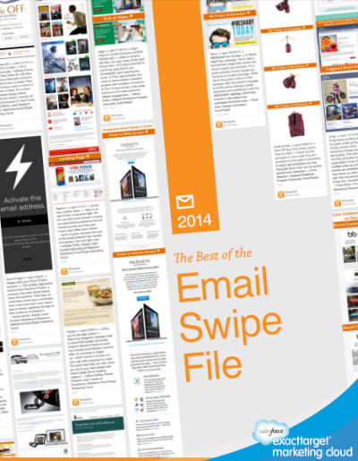 A swipe file is a record of your top-performing campaigns that you return to for learnings and ideas. It was this concept that inspired us to create the Email Swipe File on Pinterest, where we share the emails and landing pages that excite and impress us. We’ve already shared more than 310 examples of email awesomeness dating all the way back to 2006—and there’s much more to come.
In the 2014 Best of the Email Swipe File, we highlight the 20 examples from the past year that we love most and put them in the context of five trends that are having a major impact on email design:
- ADVANCED PERSONALIZATION: Personalization that goes way beyond first-name merges is one of the key ways marketers can make their messages more relevant to individual subscribers.
- TRIGGERED SOPHISTICATION: Explore ways to make triggered emails ever better—with longer campaigns, smarter content, and better triggers.
- SMART RENDERING: Rendering tactics can ensure that your message is optimized for the platform, situation, person, and time of open.
- UNIQUE VOICE: Influenced by content marketing and social media engagement, the voice of marketers is undergoing a shift from promotional, corporate and detached to helpful, conversational and timely.
- INSPIRED FUNDAMENTALS: Don’t forget the fundamental messaging and design tactics that have been effective for years, like creating messaging that’s on brand, focused, and sharable.
Learn more about these trends, see which email campaigns we loved best, and check out the ideas we most hope you’ll steal, test and make your own. Get inspired!
>> Download the 2014 Best of the Email Swipe File
Email Marketing Double-Dog Dares: Vol. 4
Posted on May 20, 2014
![]() Since email is a fast-moving, fast-evolving channel, marketers must be experimenters to succeed at a high level. With that in mind, I dare you—no, I double-dog dare you—to test these six out-of-the-box, bleeding edge, and fun/weird ideas:
Since email is a fast-moving, fast-evolving channel, marketers must be experimenters to succeed at a high level. With that in mind, I dare you—no, I double-dog dare you—to test these six out-of-the-box, bleeding edge, and fun/weird ideas:
1. Bring transparency and rewards to email activity. Especially now that ISPs are factoring engagement into their delivery algorithms, you want your subscribers to open and click your emails—and perhaps share them with their networks and take other positive, trackable actions. Why not be up front about it?
Launch an annual, biannual, or quarterly activity email that…
>> Read my entire Email Insider column on MediaPost.com
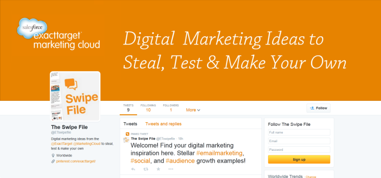
Follow the Swipe File on Twitter @ETswipefile and You’ll…
Posted on May 13, 2014
- See every new digital marketing example pinned to the Swipe File on Pinterest
- Rediscover great pins from the past every #FlashbackFriday
- Be able to chime in on which of two similar examples is the #BetterSwipe every Tuesday
- Find seasonal inspiration for your campaigns
- Learn which pins are fan favorites
- Be sure not to miss that latest Swipe File reports, blog posts, webinars, and videos
So, get your daily dose of digital marketing inspiration.
>> Follow @ETswipefile on Twitter
>>Help spread the word. Click to tweet: “Follow @ETswipefile to discover great digital marketing examples from the Swipe File. I did!”
Crowd Favorites from the Swipe File: April 2014
Posted on May 8, 2014
We pin tons of inspiring digital marketing examples to our Swipe File pinboards on Pinterest every month. And each month you tell which ones most inspired you by repinning and liking them.
Here are your favorite pins among the ones we uploaded last month:
The Email Swipe File’s crowd favorite was…
Pizza Express >> personalized birthday email with awesome images-off rendering >> View the pin
>> Browse the Email Swipe File
The Social Swipe File’s crowd favorite was…
First Cup >> used social listening to target coffee drinkers at the local level >> View the pin
>> Browse the Social Swipe File
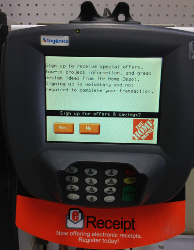
The Audience Growth Swipe File’s crowd favorite was…
Home Depot >> e-receipt with email opt-in promotion >> View the pin
>> Browse the Audience Growth Swipe File
Help determine this month’s crowd favorites by repinning and liking the Swipe File pins that inspire you most.
Unroll.Me Is a Promotions Tab in an Email
Posted on May 6, 2014
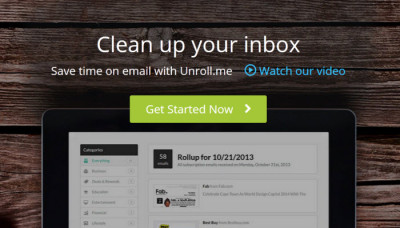 Unroll.Me is the kind of service that makes email marketers nervous. It facilitates unsubscribes and bundles messages from multiple brands into a single daily email digest, and its user base has quickly grown to more than 720,000.
However, there’s no reason for alarm. We’ve seen this before. Unroll.Me is quite similar to Gmail’s Promotions tab, which in general has had a positive effect on email marketing.
I recently spoke with Direct Marketing News Associate Editor Elyse Dupre about Unroll.Me and how marketers shouldn’t worry, but should expect the service’s growth to drive other changes in our industry.
>> Read the entire story on DMNews.com
The Last Word on April 2014
Posted on May 2, 2014
A roundup of email marketing articles, posts, tweets and examples you might have missed last month…
Must-read articles, posts & whitepapers
Reengagement Campaigns: When Should You Drop Inactives? (MediaPost)
Triggered Email Messages: Keys to Success (ClickZ)
Results and Lessons from 9 Subject Line split tests (ZettaSphere)
Gmail Continues to Shift the Market Share Landscape (Litmus)
Which Came First, Your Email Content or Your Segment? (ClickZ)
Insightful & entertaining tweets
@fchimero: There’s a special designer hell where you watch someone else use Photoshop.
@mparkerbyrd: 90% of the value of postmortems is actually in the time you spend preparing for the postmortem: forced reflection. #CreativityInc
@CaptainInbox: Wow! a great & immensely accurate list: “Announcing the Magill Report List of Vetted, Reputable Email List Vendors” http://t.co/m21IgP6Mw3
Great additions to the Swipe File pinboards
Pizza Express mosaic email sent in 2/2012 >> View the pin
Marriott responsive email sent on 3/26/14 >> View the pin
Reliant weekly power usage summary email sent on 3/24/14 >> View the pin
Noun Project confirmed opt-in email sent in 3/2014 >> View the pin
Noteworthy subject lines
Hayneedle, 4/27 — It’s time to plant!
Hayneedle, 4/22 — It IS easy being green …
Staples, 4/22 — Up to 50% off eco-friendly supplies.
Lowe’s, 4/22 — Be the Change This Earth Day
ThinkGeek, 4/22 — ThinkGeek salutes \S/upermoms!
Overstock.com, 4/22 — Mother’s Day is May 11th – Start Shopping Now
Drs. Foster & Smith, 4/22 — Become a Better Pet Parent
PersonalizationMall.com, 4/21 — Graduation Party Gifts & Decorations On Sale Now
J.Crew, 4/17 — We moonlight as wedding planners. For free.
Clinique, 4/22 — Breakouts to clear skin—change your story! Plus watch us on YouTube.
SeaWorld Orlando, 4/14 — 50th Celebration SALE: Save $5 at ShamuShop.com
Blue Nile, 4/11 — 10 Diamond Shapes to Help you Create the Perfect Ring
Uncommon Goods, 4/7 — The 50/$50 List
ModCloth, 4/11 — Open this email, get $10. Yup, it’s that easy!
OnlineShoes.com, 4/7 — Get your closet ready for the occasions ahead
Express, 4/7 — The must-have color of the season
Etsy, 4/21 — Mother May I?
Dell, 4/21 — Windows 7?
Barneys New York, 4/13 — Dreaming of Summer? Shop Swimwear, Sunwear and More Now
Drs. Foster & Smith, 4/12 — Travelling with your pet this summer?
Zappos, 4/14 — Got a yacht?
Nikon Store, 4/11 — The Lunar Eclipse is Almost Here! Will Your Photos Do it Justice?
Gerber, 4/10 — Hey Chad, have you seen our new site?
Lenovo, 4/8 — What’s the G for?
Subway, 4/1 — Have you tried our latest flavor madness?
Most popular posts on EmailMarketingRules.com
1. Infographic: The Growing Adoption of Mobile-Friendly Email Design
2. The Many Uses (and 2 Drawbacks) of Animated Gifs
3. The 1, 2, 3 of Defensive Design
4. Gmail’s 10th Anniversary: Its 3 Greatest Contributions
5. Infographic: Shopping Cart Abandonment Email Opportunities
The 3 Pitfalls of Offline Opt-ins
Posted on May 1, 2014
 Offline email signups offer many opportunities to lose a perfectly good subscriber through poor process. Shoppers at your stores, patrons at your restaurants, and visitors at your conference booths make great subscribers. The challenge is accurately collecting email addresses in these environments.
Avoid these three offline opt-in pitfalls:
- Transcription, especially without verification.
- Not setting the right expectations.
- Handing out immediate rewards for email addresses.
For all the details and examples…
>> Read the entire post on the ExactTarget Blog

Welcome! Email Marketing Rules is your guide to understanding the best practices of this complex, often misunderstood channel as you craft the best executions for your brand. Every week, we’ll explore strategies and tactics, discuss tips and inspiration, and dig into industry news and trends.
Chad S. White
GVP of CRM Strategy
Zeta Global
Author of Email Marketing Rules and nearly 4,000 articles about digital and email marketing
![]()

![]()