 Email Marketing Rules
Check Out the Curves on These Emails!
Posted on June 13, 2013
![]() Earlier this week I discussed 9 Ways to Get Subscribers to Scroll, one of which is to use S-curves. This design tactic takes advantage of saccades, the fact that the human eye jumps around as it scans things. So rather than designing things in a linear fashion, try arranging content in an S-curve, where an image on the left and text on the right is followed by an image on the right and text on the left, and so on.
Earlier this week I discussed 9 Ways to Get Subscribers to Scroll, one of which is to use S-curves. This design tactic takes advantage of saccades, the fact that the human eye jumps around as it scans things. So rather than designing things in a linear fashion, try arranging content in an S-curve, where an image on the left and text on the right is followed by an image on the right and text on the left, and so on.
The traditional S-curve is an alternation of text and images, which Zazzle demonstrated well in a Mar. 25 email. However, there are many creative variations of S-curves that are worth exploring.
For example, in a Mar. 25 email, Ann Taylor starts their S-curve in the primary content block and then extends it seamlessly down into the secondary content blocks. In an Apr. 24 email, Vera Bradley uses an S-curve where the product images are clipped by the left and right boundaries of the email.
Using two scrolling-friendly tactics, Ann Taylor combines a S-curve and a numbered list in a Mar. 31 email and smartly uses the subject line to prime subscribers to be ready to scroll to see the whole list: “5 Trends To Try | Style Alert: Exclusive Offer Tonight…” Staples also uses two scrolling-friendly tactics, combining an S-curve with lines to guide the reader’s eyes in a Mar. 4 email.
One of my favorite S-curves is in this Dec. 15, 2011 Sephora email, which uses collections of products to create a very literal S-curve.
But you don’t need a text component to create an S-curve. Images alone are enough. For instance, Restoration Hardware uses a cascade of product shots to create an S-curve in a June 11 email. And Vera Bradley creates an S-curve in a Mar. 1 email primarily by using alternating pairing of bags and sunglasses.
This is a tried-and-true design tactic that’s ripe for experimentation and creative re-interpretation. So give it a try.
9 Ways to Get Subscribers to Scroll
Posted on June 11, 2013
While there’s a trend toward shorter emails—even very short emails—don’t be fooled into thinking that subscribers won’t scroll. They will. Consistently delivering great email content is one way to get your subscribers to scroll, but there are also some design tactics you can use to encourage scrolling:
 1. Ask them to scroll. J. Jill has used this tactic on many occasions, most often placing this request to the right of their logo so it appears above the fold. Beyond asking subscribers to scroll, J. Jill gives them a compelling reason—“to see today’s great offer”—in this Mar. 22 email.
2. Train them to scroll. Consistently placing valuable content near the bottom of your emails will train subscribers to scroll over time. General Mills’ Live Better America newsletter uses this tactic by always leading with recipes and other content but always punctuating the end of their content with a banner about coupons. They often call out the coupons in their subject lines to nudge new subscribers into scrolling and teaching them that’s where they position their deals.
3. Use a numbered list. People love countdowns, top 10 lists and other kinds of ordered lists. They’re effective because people naturally want to discover what’s next in the list, so once you get them started they tend to finish out the list, especially if it’s short. Make it clear that your email contains a list by mentioning it in the subject line or at least in the headline of your email. You can do a progressive list like in this Crate & Barrel email or a countdown like the one used by Uncommon Goods to promote their top 25 Mother’s Day gifts in a May 2 email.
4. Use a calendar. A twist on a numbered list, calendars—like the one used in a May 31 Ann Taylor email to promote releases and niche holidays in June—can provide a framework for touting products in a seasonally relevant way.
5. Direct them with arrows and lines. Your eye naturally looks where arrows are pointing and naturally follows lines. For instance, in a Mar. 19 email, Gap put their promotional language inside a big arrowhead that drew your eyes down through the creative to the call-to-action at the bottom. And this horizontal-scrolling JCPenney email uses a lot of right-sloping lines to visually cue readers to scroll to the right.
6. Use long images. People like to see the whole of something, so if only a portion of an image appears in the preview pane they are likely to scroll to see the entirety of it. Some of my favorite examples of this tactic in action include this Beach Park email, this Norm Thompson email and this Brooks Brother email.
7. Use downward motion. Animated gifs can provide movement that draws your readers’ eyes down through an email. This is a rarely used tactic but can work well.
8. Use a model’s gaze or hand positioning. People are naturally curious what other people are looking or pointing at. Victoria’s Secret used this tactic in a Mar. 26 email, making effective use of the preview pane.
9. Use S-curves. Positioning a series of text blocks and images on alternating sides of an email has proven to draw the eye down through the series. This tactic is so rich with variants that I’ve written a column dedicated just to it: Check Out the Curves on These Emails!
If you’ve read this far, I’ll assume it’s because of my consistently great content rather than my use of a numbered list, although I’m sure the latter didn’t hurt.
The 1, 2, 3 of Defensive Design
Posted on June 6, 2013
Despite Outlook.com and Yahoo Mail recently moving to enable images by default, there are still many email clients that block images by default. Upwards of one-third of your emails are likely opened with images disabled. That makes “defensive design” techniques like HTML text and alt text a must.
I have a three-pronged philosophy when it comes to defensive design:
 1. Basic, low-effort defensive design should be status quo. That means baking a fair amount of HTML text and alt text into your email template, using preheader text, using HTML text and alt text in your primary and secondary messaging.
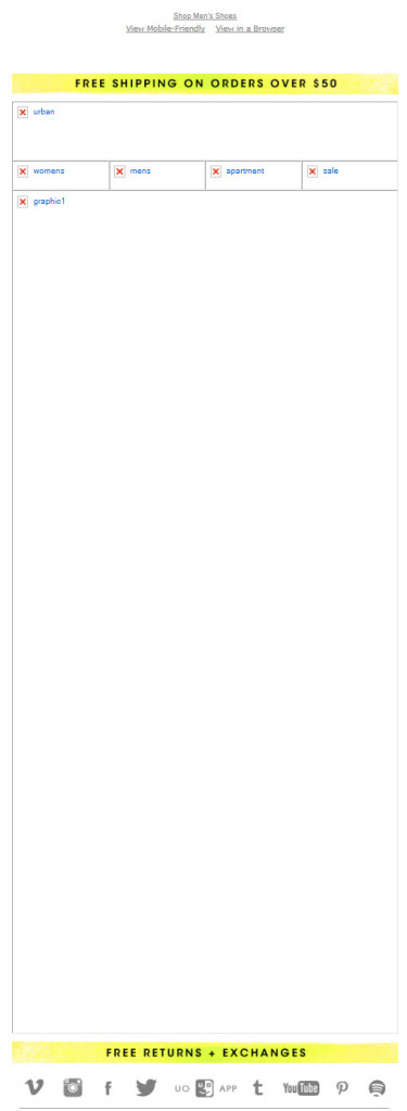
This Orbitz email is a great example of using HTML text and this B&H email uses a strong mix of HTML text and alt text. The B&H example is particularly telling since on the day that I took that screenshot, they were having image server problems or something so that none of the images loaded despite them being whitelisted. A similar issue affected a recent Urban Outfitters email, such that only some of the images loaded. It revealed that they don’t use any HTML text outside of their preheader and footer and that the alt text for their primary message block was “graphic1,” which is placeholder text they’ve used in the past.
2. More attention to defensive design is warranted for transactional emails, welcome emails, win-back emails, and re-permission emails. Since these are emails that are more likely to be viewed with images blocked, more HTML text in particular should be used.
3. Consider periodically designing more heavily for blocked images. Just like you spend more time on the image-on appearance of some emails, it’s worth spending more time on defensive design on occasion as well. More advanced techniques like using background colors for images or creating mosaics by color blocking table cells come into play here.
This Bendon Lingerie email is a great example of a simple and powerful mosaic paired with succinct alt text. And this Mothercare email uses a mosaic, background colors on images, and extensive styled alt text to create an images-off experience that rivals the images-on experience.
Future Prediction:
Considering that spam is well under control and that mobile bandwidth is becoming more plentiful, I predict that image blocking will gradually go away in the years ahead. By 2018, I think defensive design will be unnecessary. But while we wait for the future to get here, these techniques will continue to be effective and well worth marketers’ time.
JCPenney’s Mobile Aware Email Makeover
Posted on June 4, 2013
While responsive design is getting all the buzz, there are many gradations of email design between the old desktop-centric designs and full-fledged responsive designs. For marketers with smaller budgets or ones looking to take gradual steps toward being mobile-friendly, there are options.
Many brands have taken the first step and adopted what I call a quasi-mobile aware email design, which uses a single-column design with larger images, larger fonts, and larger buttons for the primary and secondary content blocks, but keeps the desktop-centric header, navigation bar, administrative links and footer. Over the past year or so, JCPenney has used both desktop-centric and quasi-mobile aware designs. But last month they took the next step up the ladder to a wholehearted mobile aware email design.
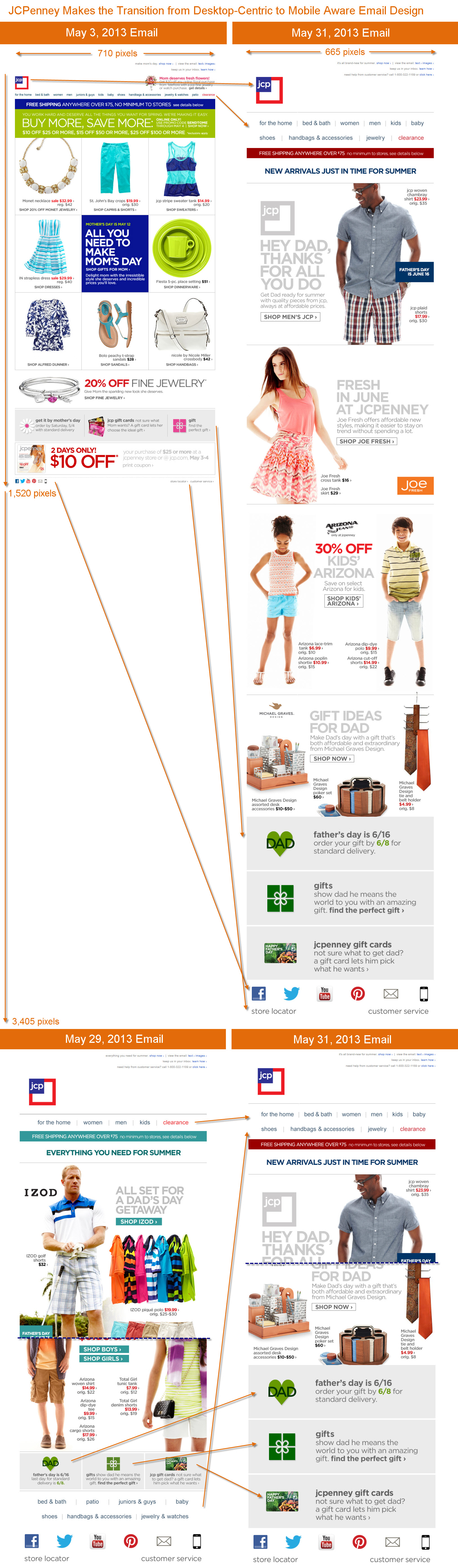
As you can see in the graphic below, the shift to fully mobile aware entailed…
- Narrowing the width of their emails to 665 pixels from 710
- Making their logo 4-times larger
- Reducing their number of navigation bar links to 10 from 12, making the remaining ones larger, and using a two-row nav bar
- Increasing the size of their content blocks, their fonts, and call-to-actions—with the main CTA for each content block now being a button
- Making their gift services footer for Father’s Day much larger than the one used to promote Mother’s Day
- Drastically increasing the size of their social media links, as well as their “store locator” and “customer service” links
All of those changes make for emails that are roughly twice as long as before, but way more mobile-friendly, especially on smartphones.
This is a smart transition to being mobile-aware. What’s also smart is how they haven’t stopped experimenting and tweaking their design. A May 29 email used both a different navigation bar design and gift services footer. The mobile behavior of consumers continues to evolve, so ongoing testing is critical.
The Last Word on May 2013
Posted on June 3, 2013
 A roundup of articles, posts, tweets and emails you might have missed last month…
Must-read articles, posts & whitepapers
A False Dichotomy (ClickZ)
Most Effective Emails Are Personal (MediaPost)
Make Your Memorial Day Email Messages Memorable (E-Dialog)
Emails We Love: Hyatt Reservation Reminder (Movable Ink)
Four Types of Email Content that Your Customers Want Now (ExactTarget)
Social Commerce Revenue By Industry (GetElastic)
Google Makes Email More Interactive With Customizable Gmail Action Buttons (Techcrunch)
A new inbox that puts you back in control (Official Gmail Blog)
Insightful & entertaining tweets
@vantran_78: Obama email marketing had 166 segments and 84 of them were tests! #MKTG13 Testing is powerful. #truth
@maxymiser: Dell saw a 203% increase in student sales with free xBox-with-purchase promotion targeted to .edu domains. #TLE2013
@rblum: No welcome email < welcome email < generic onboarding stream < targeted behavior-based emails @LorenMcDonald #spop13 #emailmarketing
@ConstantContact: There’s no such thing as a good email list that’s for sale. << We couldn’t agree more, RT if you’re with us.
@GraceofWrath: Did you know you can watch the #insideamy trailer and read @amyschumer‘s tweets IN THE EMAIL? @movableink is magic. http://t.co/eDody83p7A
@ETscreens: Remember to use responsive templates if you want your emails to look awesome on me.
@DenZhadanov: Samsung Android Screen Sizes: 2.8 3.14 3.2 3.4 3.5 3.6 3.65 3.7 3.97 4 4.2 4.27 4.3 4.5 4.52 4.65 4.8 5 5.3 5.5 5.8 6.3 7 7.7 8 10 10.1
@shannonholato: I like big buttons & I cannot lie #SPOP13 #email #design
@andrewkordek: “Automated messages” = Set and optimize…plus you need to spot test your automated messages every 4-5 months. #mpeis
@jesshastings: “Customers know we have a lot of data about them and expect us to use it.” -Jamie Nordstrom #MKTG13
@iamelliot: LinkedIn just emailed me to tell me that I left a new comment on a discussion. Cretins.
Great additions to the Email Swipe File pinboard
Toms email sent on 4/12/13 >> View the pin
Mothercare email sent on 9/10/12 >> View the pin
Pandora email sent on 4/12/13 >> View the pin
Ann Taylor email sent on 5/6/13 >> View the pin
Noteworthy subject lines
ASPCA, 5/23 — OK Tornado: What You Can Do
The Container Store, 5/17 — Go where laundry has NEVER gone before [plays off release of the latest Star Trek movie]
Tiffany & Co., 5/2 — The Jewels of The Great Gatsby
The North Face, 5/22 — Help preserve our planet by recycling apparel at our stores
Subway, 5/29 — Take a look! This meal is certified by the American Heart Association.
Walmart, 5/13 — Special Buys? ✓ Clearance? ✓ More cash in your wallet? ✓
ModCloth, 5/29 — Your 10 most-pinned items are on sale!
Sony, 5/1 — #XperiaTablet, the World’s Thinnest | Just Unveiled
Nikon Store, 5/31 — Get Inspired with Nikon World Magazine
Wayfair, 5/13 — Bar-raising pub seating, style your coffee table, accent furniture, rugs, and garden gear
Karmaloop, 5/6 — The Sale You’d Like To…
Threadless, 5/2 — The sorting hat knows which of these back in stock tees you belong in.
ModCloth, 5/26 — Your styling questions answered by our ModStylists®!
Neiman Marcus, 5/26 — Pre-Fall Trend: Violet Hues
Wayfair, 5/27 — Shop made-in-the-USA furniture to celebrate Memorial Day
Sears, 5/27 — Today, we raise the flag and drop our prices, way low!
Urban Outfitters, 5/26 — Salute the flag, dudes!
Lululemon, 5/11 — no mama drama – send an egift card
Dunkin Donuts, 5/2 — The best Mother’s Day carDD ever
Staples, 5/6 — Great gifts for Moms & grads!
HP, 5/5 — Celebrate your grad with these campus pre-reqs
TigerDirect, 5/3 — Top Cinco PCs, HDs, TVs & More
Lego, 5/1 — May the 4th be with you!
Most popular posts on EmailMarketingRules.com
1. Promoting Sister Brands without Violating Permission
2. The State of Welcome Emails #Infographic
3. Yahoo Mail Hacking Reveals Do-Not-Reply Failures
Watch ‘The Good, the Bad, and the Best’ Webinar
Posted on May 31, 2013
If you missed my webinar, “The Good, the Bad, and the Best: Practices for a Post-Wild West Email Marketing World” earlier this week, the slides (with notes) and a recording of the hour-long webinar are now available.
View the slides on SlideShare >>
Watch the webinar recording (registration required) >>
Adopting email marketing best practices isn’t about ticking boxes. It’s about execution. During this webinar I discuss a variety of best practices and share real-world examples of brands with good, bad and the best executions. Topics covered include signup forms, welcome emails, mobile-friendly emails, preheaders, personalization, unsubscribe pages, and more.
Get Inspired by ‘The Best of the Email Swipe File’
Posted on May 30, 2013
A swipe file is a record of your top-performing campaigns that you return to for learnings and ideas. It was this concept that inspired us to create the Email Swipe File on Pinterest, where we share the emails and landing pages that excite and impress us. We’ve already shared nearly 150 examples of email awesomeness dating all the way back to 2006—and there’s much more to come.
 In The Best of the Email Swipe File, we highlight the 20 examples from the past year that we love most and put them in the context of five trends that are having a major impact on email design:
- Mobile-Friendly: The shift from wide screens and mice to narrow screens and fat fingers
- Personalization: A key tactic for making messages more personally relevant
- Triggered Sophistication: Longer campaigns, smarter content and better triggers
- Editorial Voice: The influence of content marketing’ success
- Inspired Fundamentals: The tactics that have been effective for years and years
Learn more about these trends, see which emails and landing pages we loved best, and check out the ideas we most hope you’ll steal, test and make your own. Get inspired!
>> Download The Best of the Email Swipe File
Things I Would and Would Not Apologize For
Posted on May 23, 2013
Considering the complexities and high volume of our industry, mistakes are practically unavoidable. But just because you’ve made a mistake doesn’t mean an apology email is necessary.
Most brands won’t send a single apology email over the course of a year, and in recent years less than one-tenth of one percent of email volume is apologies for email mistakes. To say that apology emails are rare is an understatement.
When considering whether to send an apology and correction, remember that most of your subscribers will not have seen the email with the mistake in it. So apologizing draws additional attention to the error and sending that additional email may lead to annoyance and more unsubscribes.
With that in mind, here are some mistakes that I would not apologize for:
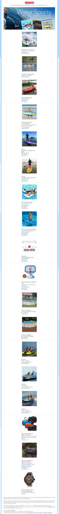 Formatting errors: An ugly, broken-up email is a reminder to be more diligent with your coding and do pre-send rendering testing, but not a cause for an apology. Just a couple of days ago Costco sent an email where their 3-column-6-row product grid broke, becoming a 1-column-18-row grid. They smartly let it go and moved on.
Typos: Unless the typo is in your coupon code or creates a profane word, it’s good to let these go as even subscribers who read the email may not notice them or will be able to figure out what you meant using sentence context. Typos in subject lines are not a special case—let those go too.
For instance, on Cyber Monday in 2011, Linens-N-Things had the following typo in the subject line of their third email of the day: “Last Chance: Cyber Monday Deals End in 60 Miutes”. They responded 2 hours later by sending an apology email—their fourth email of the day—with this subject line: “Oops! Sorry for the Typo: Cyber Monday Deals End in Minutes!” On the highest-volume day of the year, this was an ill-advised risk.
Deployment misfires: Sending out an email at the wrong time, especially with missing content, is painful and potentially embarrassing. But even these are worth letting go in most cases.
For instance, in 2007, Drs. Foster & Smith sent out a “Happy Thanksgiving” seasons greeting email a full week early. They didn’t send an apology or resend it the following week. They just let it stand as an early seasons greeting.
And earlier this year, Amazon.com accidentally sent out an email promoting BCS championship gear 24 hours before the game was to take place. They sent an apology, but it was really unnecessary as it was clearly an error to those most likely to buy the gear. They should have just sent the email after the game as planned and in the meantime used the landing page to make it clear that championship gear would be available at the conclusion of the game “tomorrow.”
All that said, here are the three email mistakes that would cause me to send an apology:
1. An email error that seriously impairs the message, such as the wrong coupon code for the primary message or mistakes in the critical links in an email.
 2. An email accidentally sent to the list of a sister brand. Permission is sacred. Accidentally violating it is worth apologizing for and making it clear that they won’t receive any more messages from the sister brand—with the subtext being, “Please don’t mark that email as spam.”
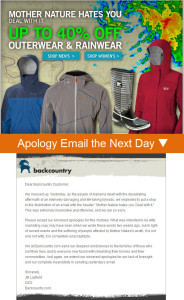
3. An email that was unintentionally offensive. For example, in 2011, Backcountry.com sent an email with the headline “Mother Nature Hates You. Deal with It.” That email was sent on the same day that lethal tornadoes devastated Alabama. Backcountry wisely sent an apology, explaining themselves and saying they were wrong in no uncertain terms.
I hope you’re able to avoid an apology-worthy email mistake, but it’s a good idea to have a contingency plan in place and an apology email drafted, just in case.
Once Again, I Double-Dog Dare You!
Posted on May 21, 2013
![]() In 2008 and 2010 I double-dog dared marketers to experiment with some little-used, out-of-the-box, perhaps even weird tactics. Some of those tactics are not so uncommon anymore while others are just as rare as they ever were.
In 2008 and 2010 I double-dog dared marketers to experiment with some little-used, out-of-the-box, perhaps even weird tactics. Some of those tactics are not so uncommon anymore while others are just as rare as they ever were.
Since it’s been more than three years and email marketing is all about experimentation, I think we need some fresh dares. So here we go. I dare you—no, I double-dog dare you!—to… Read my entire Email Insider column >>
Email Marketing Rules Is Now on Pinterest
Posted on May 20, 2013
You can now find every image posted on EmailMarketingRules.com on Pinterest. Just visit the Email Marketing Rules pinboard or click on any image in any of my posts and you’ll be taken directly to the pin on Pinterest.
Also be sure to check out ExactTarget’s other pinboards including:
Email Swipe File
Facebook Swipe File
Infographics!
…and many more.
Happy pinning!

Welcome! Email Marketing Rules is your guide to understanding the best practices of this complex, often misunderstood channel as you craft the best executions for your brand. Every week, we’ll explore strategies and tactics, discuss tips and inspiration, and dig into industry news and trends.
Chad S. White
Head of Research
Oracle Digital Experience Agency
Author of Email Marketing Rules and nearly 4,000 articles about digital and email marketing
![]()

![]()