 Email Marketing Rules
Email Signup Failures at Crisis Levels
Posted on April 11, 2013
Opt-in failures are costing brands high-quality subscribers and dampening their list growth. More than 15% of homepage and site registration email signup processes resulted in failures, according to ExactTarget research involving more than 160 B2C brands, including retailers, restaurants, manufacturers, travel and hospitality, and nonprofits. This is a worsening from several years ago when signup failures hovered around an already-too-high 12%.
 These failures are particularly costly because people who signup via your website are your most valuable subscribers. So losing these has an outsized effect on your email program’s ROI.
While it’s not clear why many of the signups failed, some program characteristics coincided with higher and lower failure rates:
Using confirmed opt-in (COI): Brands that use COI, where a subscriber has to click on a link in a signup confirmation email to complete the signup process, were more likely to have their subscriptions fail. Nearly 27% of the brands using COI suffered signup failures.
For example, GoDaddy’s COI failed because every time you confirmed the signup by clicking on the link in the signup confirmation request email, it sent you another signup confirmation request email and bounced you back to the page notifying you that you have to confirm your subscription by clicking on the link in the email they just sent you. Simply put, it created an infinite loop that you could never break out of.
Sending a welcome email: Signups were less likely to fail if a brand was able to successfully deliver a welcome email. Only 9% of brands saw their signups fail after delivering a welcome email. (See More Brands Sending Welcome Emails, But Opportunities Remain.)
Sending a welcome email series: Not a single brand that delivered a welcome email series saw their signup fail subsequently. (See Quarter of B2C Marketers Send a Welcome Email Series.) This is likely an indication of greater sophistication and therefore better controls.
The high level of signup failures speaks to a need to do more subscription process audits, which have become more complex in recent years.
Platform proliferation means there are now more devices, more operating systems and more browsers to check since they all don’t work the same together. For instance, Discovery Store’s signup form encountered a fatal error when using Firefox on Windows 7, but worked fine when using Internet Explorer.
Acquisition source proliferation means there are now more channels to check. For instance, is your text-to-subscribe working properly? Does the email signup form on your Facebook page work? Does the email signup during checkout on your mobile app work? Tracking your subscribers by acquisition source can help you uncover signup issues, in addition to helping you make decisions about subscriber value by acquisition source.
If you haven’t done an acquisition source audit recently, it’s probably time to do one as you could be unknowingly losing valuable subscribers.
Yahoo Mail Hacking Reveals Do-Not-Reply Failures
Posted on April 9, 2013
Much has been written about all the Yahoo Mail accounts that have been hacked in recent months. One of my tracking accounts was among those hacked and hijacked into sending a spam email to each of the contacts in my address book—which was full of sender addresses used by retailers to send promotional email.
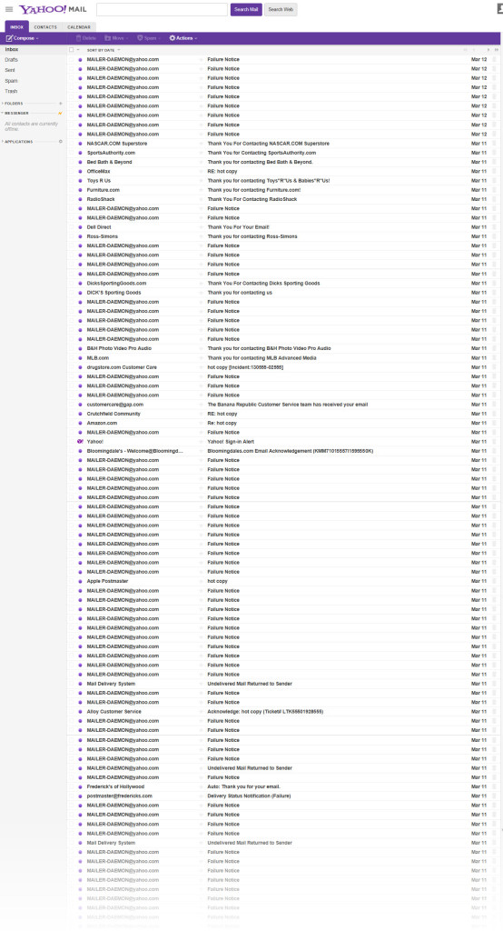 The resulting stream of “Failure Notice” messages made for a poignant commentary on the practice of using do-not-reply email addresses and mailboxes that don’t accept email. Even the “Thank you for contacting us” replies were mostly just messages saying that you reached an unmonitored inbox and instructing you to contact them by other means. Only a handful of brands including Alloy, Banana Republic, Crutchfield and Drugstore.com confirmed receipt of the message and said they’d reply (which none of them did considering it was obviously spam).
In the past, opponents of do-not-reply addresses have argued that they’re subscriber-unfriendly, that they send the message that it’s okay for the marketer to email the subscriber but not vice versa. Making it impossible to easily reply to messages eliminates interactions that might otherwise occur, which is a detriment to the marketer and their brand. Those points continue to be true.
However, over the past year or two, a new reason has emerged to ditch the do-not-reply address and start monitoring the replies to your promotional messages: deliverability. ISPs now factor in engagement metrics when determining whether to deliver, junk or block your emails. So if your subscribers open, scroll through, click, mark as important, forward, reply to or otherwise interact with your emails, then your future emails are more likely to be welcome.
While monitoring promotional email sender address accounts can be a chore because of all the spam and out-of-office auto-replies they get, more tools are now available to separate the signal from the noise.
So if you’re still using a do-not-reply address, you now have one less reason to keep using it and one more reason to make the switch.
The Many Gradations of Mobile Email Design
Posted on April 4, 2013
With mobile email reading now beyond the critical mass stage for nearly every brand, marketers are finally making creating mobile-friendly emails a priority. According to a MarketingSherpa survey, it’s an even greater priority than integrating email and social, which I think is very appropriate and overdue.
 My design colleagues here at ExactTarget just released Designing for the Mobile Inbox, a report that gives a great overview of the need for mobile email design and discusses the basics of mobile aware design and responsive design and how they’re different from desktop-centric design.
While it’s helpful to think of email design as falling into those three major buckets, there are actually intermediary steps along the way from desktop-centric design to truly responsive design, and many of the brands I watch are definitely taking intermediary steps:
1. Desktop-Centric Design: Traditional design that’s wide for viewing on desktop and laptop monitors and small links and buttons that are intended for clicking on with a cursor
By my estimation, most marketers are still here at square one.
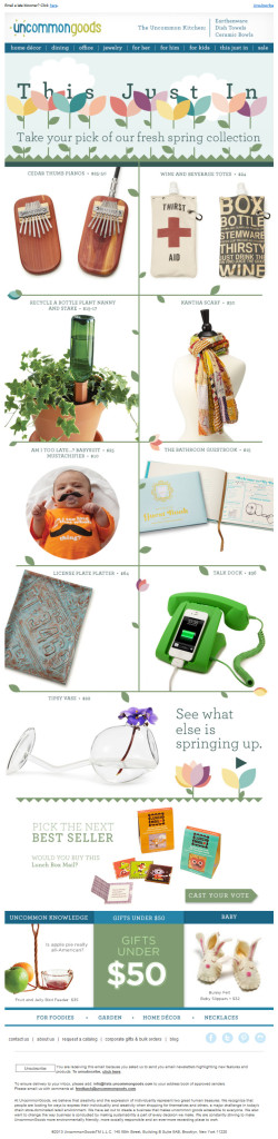
2. Quasi-Mobile Aware Design: The primary and secondary messages use images and buttons that are mobile-friendly, but the header, navigation bar and footer are still desktop-centric
This is the first step that many marketers take toward being mobile-friendly. Rather than overhaul their entire template, they’re improving the content that changes from email to email. Uncommon Goods is a good example of this approach. Their primary and secondary messages are mobile aware, but their navigation bar and footer aren’t touch-friendly yet.
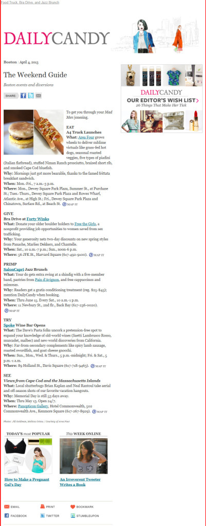 3. Mobile Aware Design: A single email design that works pretty well on both desktops and mobile devices
Skinny designs fall into this category. I like the creative approach taken by Daily Candy, which makes the entire right-hand side of their emails expendable in case it’s clipped by a small screen.
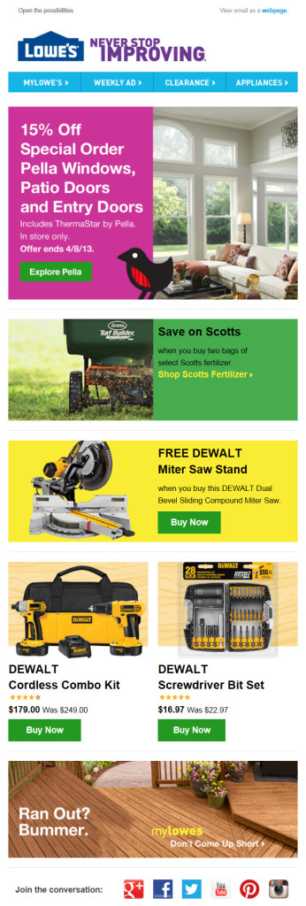
Spacious designs—with large images, large type and large buttons—that look good on tablets but scale down nicely for smartphones also fall into this category. Lowe’s emails are a good example of this approach.
4. Fluid, Liquid or Scalable Design: Expanding or contracting to fill the screen size, the design keeps everything on the screen to avoid the need for pinching on touchscreens
 5. Adaptive Design: The design generally uses one or two pixel-width “breakpoints” that correspond to typical screen sizes for smartphones, tablets and desktops to trigger content changes and reformatting so reading the content is optimized for those screen sizes
This flavor of design is often lumped into responsive design, although it’s technically simpler and more predictable in terms of rendering. For instance, we recently called this Starwood email and this REI email responsive when they’re actually adaptive designs with a single breakpoint that converts the email from desktop-friendly to smartphone-friendly. Many marketers will likely never see the need to improve their email designs beyond this point.
6. Responsive Design: The design format and content dynamically changes based on the screen size
This is held up as the holy grail of email design, but there’s very little true responsive design out there in terms of emails. To get a sense of what responsive design can do, just adjust your browser window when reading my blog, which is fully responsive. You’ll see the size of the images and text change dynamically, as well as the content reorient itself, all the way down to a screen width of just 180 pixels.
How mobile-friendly are your email designs currently and which flavor of mobile email design are you aiming for in the future?
The Last Word on March 2013
Posted on April 2, 2013
 A roundup of articles, posts, tweets and emails you might have missed last month:
Must-read articles, posts & whitepapers
Responsive email design (#RED)
Marketers Push to Take Email Mobile
Marketing In The Age Of The Inbox Within The Inbox
Using a Popover as an Acquisition Tactic
Triggered Emails Secure Higher Open Rates, Engagement
Insightful & entertaining tweets
@stylecampaign: Anyone….how are they doing this? http://t.co/VkoivrrJzL v @alexcwilliams
@stylecampaign: Great @alexcwilliams already figured it out http://t.co/qSMYl0eKNK (cheers!)
@jackexmachina: Just received an invite to a “mobile email master class” that looked like junk on my phone. What is this, amateur night?
@AdamTSutton: At the end of the day, all that matters… is slapping yourself for #cliche copy
Great additions to the Email Swipe File pinboard
Zulily welcome email series sent during Q1 of 2013 >>View the pin
Warby Parker triggered email sent in 12/2012 >>View the pin
The White House email sent 3/15/13 >>View the pin
Anthropologie email sent on 3/15/13 >>View the pin
Noteworthy subject lines
Horchow, 3/4 — #ThenAndNow video with Roger and Sally Horchow + Friends & Family starts tomorrow!
ModCloth, 3/28 — Our most ‘Pinteresting’ pieces + wedding-worthy frocks!
Zazzle, 3/22 — Make your own Zazzle products with Instagram!
Container Store, 3/29 — Do you know what’s in your fridge?
Michael’s, 3/4 — March is National Craft Month. What will you make?
West Elm Market, 3/22 — Blue, yellow, red or orange?
UnderArmour, 3/28 — It Won’t Be Cold Forever.
Wayfair, 3/27 — ✿Floral bedroom decor, patio set upgrades, hosting essentials, bedroom under $400, living room furniture and more
DCCC.org, 3/22 — Mitch McConnell actually said this:
Karmaloop, 3/19 — Extended! KL Code: CELTIC
Neiman Marcus, 3/6 — Dress for the Year of the Snake
Tiny Prints, 3/28 — The 2013 Grad Collection Is Here!
SkyMall, 3/28 — From Now Until Opening Day, Save 25% at SkyMall!
ThinkGeek, 3/22 — ThinkGeek’s sorry you couldn’t go to PAX…
Lululemon Athetica, 3/26 — yoga on the rocks
Etsy, 3/16 — ROYGBIV
Urban Outfitters, 3/18 — One Thousand Shoes & Counting!
ASPCA, 3/15 — Top Five Pet Poisons of the Year
Walgreens, 3/4 — Say hello to Britain’s #1 beauty secret | 20% OFF Contacts
Most popular posts on EmailMarketingRules.com
1. The Email Marketing Rules Book Is Now Available!
2. Quarter of B2C Marketers Send a Welcome Email Series
3. More Brands Sending Welcome Emails, But Opportunities Remain
More Fields, Fewer Subscribers
Posted on March 28, 2013
Companies spend a lot of time and money optimizing their online checkout pages because they know that checkout abandonment is money lost. The same is true of email subscription forms—higher abandonment means slower list growth and therefore less money generated by the email program. Yet, brands don’t appear to be giving these forms nearly the same level of attention.
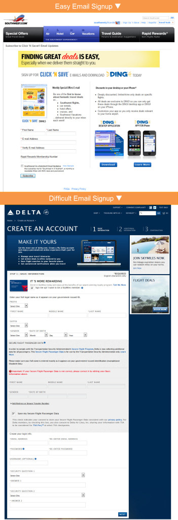 After signing up for emails from more than 160 B2C brands, I saw many behaviors that are reducing signup completions, including:
Forcing consumers to register in order to receive emails. An email relationship is an incremental one. It’s like a conversation—You don’t blurt everything out at once in a huge monologue, but rather reveal a little at a time over the course of the back-and-forth of the conversation.
It starts with them sharing their email address, and then if they enjoy what you say after that then they give you more information through email and browse behavior, via progressive profiling, and by checking out or registering.
For example, Southwest Airlines eases into the email relationship, asking for relatively little information. On the other hand, Delta Air Lines requires consumers to register with their site in order to receive emails. The “Basic Information” portion of their registration form alone has 25 fields and includes TSA warnings that get people thinking about airport hassles instead of saving on a fun getaway.
Very few retailers still require consumers to register in order to sign up for promotional emails, but many non-retailers still require registration.
Asking for too much information, especially additional contact information. Even if they’re not asking you to register with the site and set up a user name, password and security questions, some brands are just one step shy of that and ask for mailing addresses, phone numbers and other details that have absolutely nothing to do with fulfilling an email subscription.
Not only do more fields lower completion rates, but consumers are suspicious of brands who ask additional points of contact like mailing addresses, which lowers completion rates even more, according to research. Especially if you sell online, there’s no reason to try to grab tons of information upfront, because if your emails are effective then your subscribers will be buying from you and you’ll collect mailing addresses and phone numbers during checkout.
Most retailers have figured this out, with many only asking for a consumer’s email address in order to opt in. Some also ask for a zip code to do segmentation or personalization, and some ask for a first name for personalization. But many non-retailers are well behind the curve when it comes to keeping email opt-ins simple and then using progressive profiling or checkouts to collect additional information.
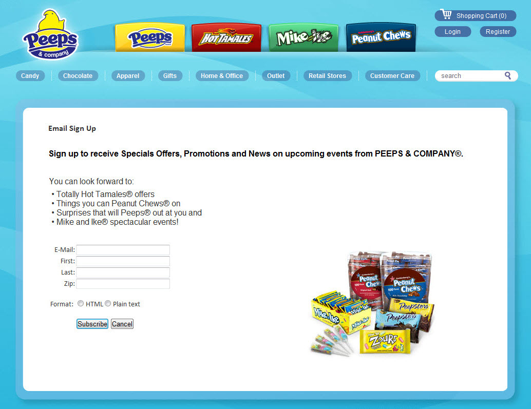
Making consumers accept content they don’t want to get the content they do want. You would like for consumers to be interested in all of your brands, and you’d certainly like to leverage their interest in one of your brands to get them interested in your others. But you have to tread softly.
For instance, Peeps and Company doesn’t give their subscribers a choice as to which brands they get content from. If you want to get Peeps updates, you also have to get updates about Peanut Chews, Hot Tamales, and Mike & Ike. Let your subscribers choose which products they’re interested in and make that the focus of your message, and use secondary messaging to occasionally promote your other brands.
All three of these practices reduce email signups. What’s more, our research only looked at homepage email opt-ins, which are generally among the most productive you can get. So the opportunity cost of long and inefficient forms there is higher than average.
The Fundamental Imperatives of ‘Email Marketing Rules’
Posted on March 26, 2013
![]() Back in November of 2010, I wrote an Email Insider column titled ‘Best Practices’ Are Dead, in which I argued that the term “best practices” has been much abused and was too broad to cover what I called the never-break “Ethical Imperatives” and the okay-but-unwise-to-break “Recommended Practices.” I didn’t know it at the time, but that column would be the genesis of my new book, Email Marketing Rules: How to Wear a White Hat, Shoot Straight, and Win Hearts, which discusses 108 email marketing best practices.
Back in November of 2010, I wrote an Email Insider column titled ‘Best Practices’ Are Dead, in which I argued that the term “best practices” has been much abused and was too broad to cover what I called the never-break “Ethical Imperatives” and the okay-but-unwise-to-break “Recommended Practices.” I didn’t know it at the time, but that column would be the genesis of my new book, Email Marketing Rules: How to Wear a White Hat, Shoot Straight, and Win Hearts, which discusses 108 email marketing best practices.
That column discussed six practices that I consider critical to being a legitimate member of the email marketing community. All six involved permission, which is still the vital element that separates us from spammers.
The book expands on those never-break rules, bringing the total to 10, which I’m delighted to share exclusively with you here… Read my entire Email Insider column >>
The Higher Bar for Browse Abandonment Emails
Posted on March 21, 2013
Because of their high ROI, cart abandonment emails are growing in popularity, although only 20% of retailers are using them, according to recent research. Adoption is even lower for browse abandonment emails, which are emails that are triggered in response to a subscriber browsing your website but not purchasing anything. However, that lower usage rate is to be expected because browse abandonment is intrinsically more complicated because the subscriber’s intention is much less clear.
With a cart abandonment, the subscriber has made their product choice or at least seriously narrowed it. But with a browse abandonment, it’s significantly much less clear if they product they last viewed was a great interest to them or not. Browsing can just as easily indicate directional product category interest as it can interest in a specific product.
Because of that, it leads to many potential questions: Did the subscriber like the product but just isn’t ready to buy? Did they like the product but were unsure if it was a good deal? Were they unsure if it had all the features they needed? Were they unsure about the product’s quality?
In a store, a shopper could ask an associate for more information and the associate would be able to ask questions to help the shopper come to a decision. Recreating those interactions in an email is challenging but increasingly feasible.
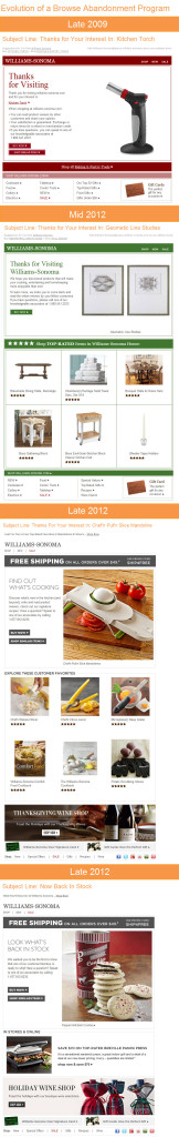
The evolution of Williams-Sonoma’s browse abandonment email program is a great example of how these emails have become more sophisticated. Williams-Sonoma was one of the earliest adopters of browse abandonment emails, sending them as early as 2009. Back then they acted like many of the cart abandonment emails do today, reminding the subscriber of the item they browsed and of some of the reasons to shop with the retailer.
Over time Williams-Sonoma recognized that a browser’s interest was less focused than a cart abandoner, so they added some top-rated products to these emails and then later made those additional product promotions more tightly related to the product that was browsed. They also added a “Shop Similar Items” call-to-action to the “Buy Now” CTA for the browsed product. By the end of last year, they were also including banners for seasonal products, like wine for Thanksgiving and Christmas dinners.
In addition to broadening out the messaging, Williams-Sonoma’s program also began to address the different reasons for abandonment more specifically. For instance, if an out-of-stock product was browsed, they made the logical assumption that you might be interested in purchasing it when it’s back in stock and send you a notification when it is.
And there’s certainly more room to up the sophistication further. Crutchfield’s browse abandonment program is my favorite. They have different ones set up to address subscribers who browse different product categories like HDTVs, Blu-Ray players, stereo receivers, 6-3/4” speakers, and DSLR cameras, as you can see in this example. It was sent in response to me browsing the Nikon D5100. You can see how they used that information as a starting point but went well beyond it to get at what my needs and concerns might have been, just like a good store associate would have done.
1 in 10 B2C Marketers Using Lightboxes for Email Signups
Posted on March 19, 2013
More prominent email signup forms and links perform better. In-your-face lightboxes take this logic to the far end of spectrum and are enjoying growing popularity, particularly among retailers.
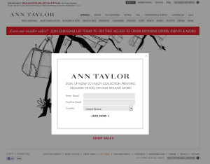
Unlikely the justly vilified pop-up and pop-under, lightboxes or popovers don’t launch a new window. They are a part of the page you’re already viewing and require you to complete the form or close the lightbox to regain access to the rest of the webpage, which is usually greyed out in the background, as you can see in this Ann Taylor example.
Ten percent of marketers are using lightboxes for email signups, according to ExactTarget research involving more than 160 B2C brands, including retailers, restaurants, manufacturers, travel and hospitality, and nonprofits. With more than 13% of retailers using an email signup lightbox, they are more than three times more likely to use this tactic than non-retailers. A few years ago hardly any marketers were using lightboxes.
The risk with lightboxes is that they are interruptive and therefore potentially annoying if they pop up too often. To minimize this risk, most brands set limits on how often lightboxes can be triggered for a particular visitor and some only trigger them for first-time visitors. Some also delay the launch of the lightbox for five or more seconds to give visitors a chance to start engaging with the site.
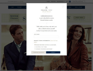
While all the talk lately has been about lightboxes for email signups, roughly as many marketers use them for post-signup confirmation instead. This is particularly true of brands like Brooks Brothers that have an email signup form in the footer of all their webpages. Their post-signup lightbox thanks the new subscriber for signing up and also asks for some additional information and preferences to improve their email experience.
Quarter of B2C Marketers Send a Welcome Email Series
Posted on March 14, 2013
Not only are more B2C marketers sending welcome emails, more are sending welcome email series. The first weeks of an email marketing relationship are the most critical, so they deserve the extra attention that a welcome email series can provide.
Twenty-five percent of marketers send a welcome email series, according to ExactTarget research involving more than 160 B2C brands, including retailers, restaurants, manufacturers, travel and hospitality, and nonprofits. Of those marketers that send welcomes, 31% send a welcome email series rather than a single welcome email.
With 30% of retailers sending a welcome email series, they are nearly twice as likely as non-retailers to do so. And the percentage of retailers sending a welcome email series has tripled since 2009.
Many welcome email series included three emails, but a few included as many as five. Most of the emails in these series were interspersed with the brand’s usual promotional emails rather than all sent sequentially.
The messaging in each of the emails generally was one of the following:
- Promotional welcome offer, which tended to be a percentage-off or free shipping offer
- Reminder of soon-to-expire welcome offer
- Touting private label goods
- Follow us on social media
- Download our mobile app
- Explanation of website features and tools
- Introduction of store services
Welcome email series are even more powerful when you tailor them to different subscribers based on how they joined your email list (homepage, store, etc.) or their previous interactions with your brand.
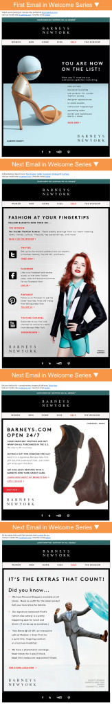
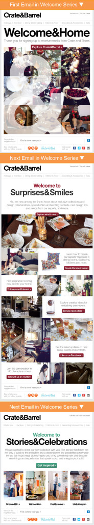
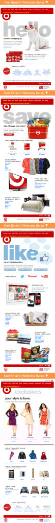
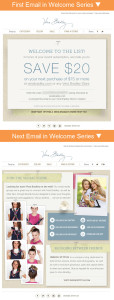
Below are six of my favorite welcome email series from Barney’s, Crate & Barrel, eBags, Target, Vera Bradley and Zulily.


More Brands Sending Welcome Emails, But Opportunities Remain
Posted on March 12, 2013
Welcome emails are among the top-performing emails that a marketer can send, so I was happy when my latest research found that more brands than ever are sending them. However, a closer look uncovered that there are still big opportunities for marketers to get better performance from their welcome emails.
 Nearly 81% of B2C marketers send welcome emails to their new subscribers, according to ExactTarget research involving more than 160 B2C brands, including retailers, restaurants, manufacturers, travel and hospitality, and nonprofits.
Retailers are considerably more likely than non-retailers to send a welcome email, with nearly 87% of retailers sending one versus only 70% of non-retailers. When I last looked at retailers’ welcome email practices in 2009, more than 74% were sending welcome emails, so adoption has grown significantly among that group.
Although adoption has increased, the effectiveness of welcome emails is still dampened by a couple of factors.
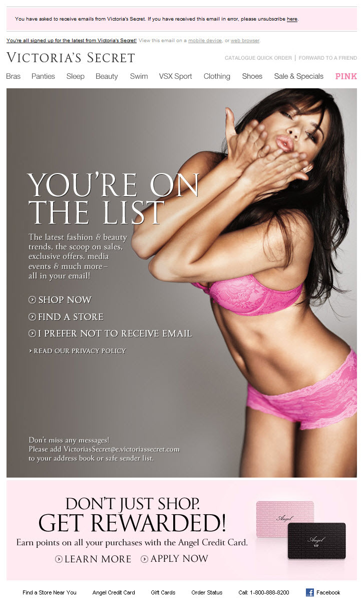
First, some marketers don’t send their welcome emails immediately after signup, when subscribers are most likely to open and act on them. For example, welcome emails from Applebee’s, West Elm and several other brands took 3 or more days to arrive. And Victoria’s Secret’s welcome email didn’t arrive until 2 weeks after signup. Delaying the delivery of your welcome email drastically reduces its effectiveness.
And second, a number of marketers also sent welcome emails that rendered poorly, including the ones from Tide and Drs. Foster & Smith. Because welcome emails are key to delivering a good first impression, make sure that yours renders well—with and without images enabled. Because ISPs change their coding support without notice, it’s wise to periodically confirm that your welcome and other triggered emails are still displaying as intended.
 On the plus side, marketers have gotten much better at using their welcome emails to drive action, whether it’s trying to ring up a sale, doing progressive profiling, or exposing new subscribers to their mobile app or social media presence.
Marketers are also making their unsubscribe links more prominent in their welcome emails, in case a new subscriber has second thoughts. Recognizing that unsubscribes are way preferred over spam complaints, brands like Victoria’s Secret include opt-out links in the preheader and the primary message block. I was relieved to see that only one brand sent a welcome email that wasn’t CAN-SPAM compliant.
When’s the last time you reviewed and updated your welcome email?

Welcome! Email Marketing Rules is your guide to understanding the best practices of this complex, often misunderstood channel as you craft the best executions for your brand. Every week, we’ll explore strategies and tactics, discuss tips and inspiration, and dig into industry news and trends.
Chad S. White
Head of Research
Oracle Digital Experience Agency
Author of Email Marketing Rules and nearly 4,000 articles about digital and email marketing
![]()

![]()