 Email Marketing Rules
JCPenney’s Mobile Aware Email Makeover
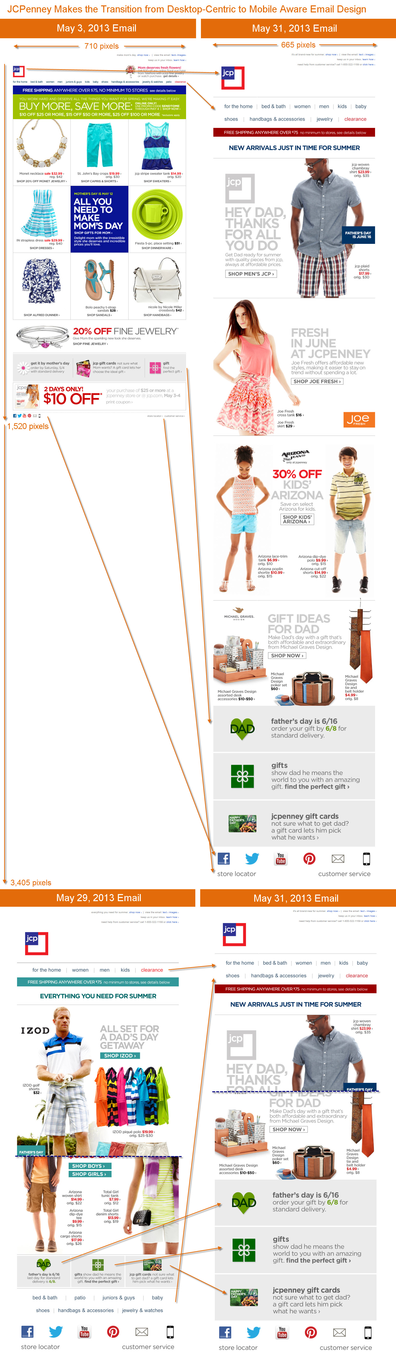
While responsive design is getting all the buzz, there are many gradations of email design between the old desktop-centric designs and full-fledged responsive designs. For marketers with smaller budgets or ones looking to take gradual steps toward being mobile-friendly, there are options.
Many brands have taken the first step and adopted what I call a quasi-mobile aware email design, which uses a single-column design with larger images, larger fonts, and larger buttons for the primary and secondary content blocks, but keeps the desktop-centric header, navigation bar, administrative links and footer. Over the past year or so, JCPenney has used both desktop-centric and quasi-mobile aware designs. But last month they took the next step up the ladder to a wholehearted mobile aware email design.
As you can see in the graphic below, the shift to fully mobile aware entailed…
- Narrowing the width of their emails to 665 pixels from 710
- Making their logo 4-times larger
- Reducing their number of navigation bar links to 10 from 12, making the remaining ones larger, and using a two-row nav bar
- Increasing the size of their content blocks, their fonts, and call-to-actions—with the main CTA for each content block now being a button
- Making their gift services footer for Father’s Day much larger than the one used to promote Mother’s Day
- Drastically increasing the size of their social media links, as well as their “store locator” and “customer service” links
All of those changes make for emails that are roughly twice as long as before, but way more mobile-friendly, especially on smartphones.
This is a smart transition to being mobile-aware. What’s also smart is how they haven’t stopped experimenting and tweaking their design. A May 29 email used both a different navigation bar design and gift services footer. The mobile behavior of consumers continues to evolve, so ongoing testing is critical.
2 Comments on “JCPenney’s Mobile Aware Email Makeover”
Leave a Reply

Welcome! Email Marketing Rules is your guide to understanding the best practices of this complex, often misunderstood channel as you craft the best executions for your brand. Every week, we’ll explore strategies and tactics, discuss tips and inspiration, and dig into industry news and trends.
Chad S. White
Head of Research
Oracle Digital Experience Agency
Author of Email Marketing Rules and nearly 4,000 articles about digital and email marketing


Features


It looks like mobile aware design trumps above the fold design. What do you suggest JCPenny tweak next? Should they test the placement of the navigation links (fitting them in the white space to the right of the logo)?
There are definitely opportunities to explore in the preheader and header. The white space to the right of the logo is probably the biggest opportunity. I’d drop the preheader text into that space or pull the navigation bar links up into that space. If the preheader text stays where it is, I’d consider left-justifying it to make it more friendly for Android users, as well as reducing the preheader text down to a line (or maybe two) vs. their current three would pull more copy onto that first screen upon opening the email.