 Email Marketing Rules
Email Subscriber Lifecycle Strategies from the Swipe File
Posted on September 23, 2014
To maximize the value of an email relationship, you need to cater to your subscribers’ needs and wants throughout their entire subscriber lifecycle. My presentation at Connections today talked about the six stages of the subscriber lifestyle and shared research, advice, and examples pertaining to each stage.
Here’s my slide deck, followed by links to the resources that I refer to in it.
Email Marketing Rules (2nd Ed.)
>> Get details about the book on Amazon.com
The Swipe File
>> View the pinboards on Pinterest
Retail Touchpoints Optimized
>> Download the report via ExactTarget.com
Zillow acquisition example: mobile app
>> View in the Audience Growth Swipe File
Krispy Kreme acquisition example: Product packaging
>> View in the Audience Growth Swipe File
Olive Garden acquisition examples: Signup opportunities in restaurants
>> View example #1 in the Audience Growth Swipe File
>> View example #2 in the Audience Growth Swipe File
Home Depot acquisition example: Opt-in via e-receipt
>> View in the Audience Growth Swipe File
Noun Project acquisition example: Opt-in confirmation email
>> View in the Email Swipe File
State of Marketing 2014
>> Download the report via ExactTarget.com
Pinterest onboarding example: Welcome series
>> View in the Email Swipe File
Walmart onboarding example: Holiday-themed welcome email
>> View in the Email Swipe File
At the Tipping Point for Mobile-Friendly Email Design
>> Read on the ExactTarget blog
The Growing Adoption of Mobile-Friendly Email Design #Infographic
>> Read on the ExactTarget blog
Reliant engagement example: Personalized weekly summary email
>> View in the Email Swipe File
Hipmunk engagement example: Infographic email
>> View in the Email Swipe File
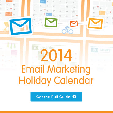
2014 Email Marketing Holiday Calendar
>> Download the guide via ExactTarget.com
American Apparel reengagement example: Reengagement email
>> View in the Email Swipe File
Pinkberry reengagement example: Mobile app reengagement email
>> View in the Email Swipe File
Lowe’s super-engagement example: Progressive profiling email
>> View in the Email Swipe File
ModCloth super-engagement example: Signup anniversary email
>> View in the Email Swipe File
Crate & Barrel super-engagement example: Post-purchase care instructions email
>> View in the Email Swipe File
Starbucks super-engagement example: Loyalty program milestone email
>> View in the Email Swipe File
Staples transition example: Unsubscribe page
>> View in the Email Swipe File
Democratic Congressional Campaign Committee transition example: Opt-out confirmation page
>> View in the Audience Growth Swipe File
Mini USA transition example: Re-permission email
Getting Email Out of the Friend Zone
Posted on September 17, 2014
 Email may be a fairly mature channel, but it still outshines other newer, sexier channels like mobile and social. In the fact, the emergence of those channels has only strengthened email, cementing it as the power retention marketing channel.
In this interview with Elyse Dupre of DM News, I make the case that email marketing has lost none of its luster and share some advice on how to get the most out of your program.
>> Read the interview on DMNews.com
5 New Email Marketing Terms
Posted on September 16, 2014
 As a former journalist, I love how email marketing is always changing. As an English major, I love language. At the intersection of those is the creation of new terms to describe emerging and existing practices, tactics, and tools in email marketing.
Over the past decade, I was in the right place at the right time to coin the terms share with your network (SWYN) and video gif, among others. Giving things a name is extremely powerful, as it facilitates conversations and raises awareness. For instance, the explosion of activity around content marketing is due in large part to it being giving the name content marketing, as this practice has certainly been around for a very long time.
In my first guest post for the Convince & Convert blog, I introduce five new email marketing terms you should know…
- Granted Media
- Super-Engagement
- Opt Up
- Real List Growth
- Confirmed Opt-In Lite (COIL)
>> Read the full article on the Convince & Convert blog
Acknowledgments & Quotes: Who to Follow and What to Read
Posted on September 15, 2014
 On the Acknowledgments page of my book, I tip my hat to some of the folks that have influenced me most. And throughout my book, I quote people—many of them authors—who are great sources of additional information.
I highly recommend that you follow these people and learn from them. To make it easier, I’ve created a richer Acknowledgments page on my website that includes links to Twitter accounts, LinkedIn profiles, books published, and articles and posts written.
There’s also a slide deck on that page that highlights the epigraphs throughout Email Marketing Rules. These are profound and poignant quotes that provide additional perspective on various email marketing topics. I hope you find them as inspiring as I do.
Thanks again to everyone who has shaped, confirmed, and challenged my views over the years.
>> Visit the Acknowledgements & Quotes page
Crowd Favorites from the Swipe File: August 2014
Posted on September 11, 2014
 We pin tons of inspiring digital marketing examples to our Swipe File pinboards on Pinterest every month. And each month you tell which ones most inspired you by repinning and liking them.
Here are your favorite pins among the ones we uploaded last month:
The Email Swipe File’s crowd favorite was…
Fab apologizes for cat-filled test email with cat-filled apology email >> View the pin
>> Browse the Email Swipe File
The Mobile Swipe File’s crowd favorite was…
Vine push message is aware of its context >> View the pin
The Social Swipe File’s crowd favorite was…
NBA Cares attracts followers with charity event pictures and details >> View the pin
The Audience Growth Swipe File’s crowd favorite was…
The Eiteljorg Museum turns a business card into a social calling card >> View the pin
Help determine this month’s crowd favorites by repinning and liking the pins that inspire you most.
The Email Marketing Rules for Measuring Success
Posted on September 9, 2014
![]() In my latest Email Insider column for MediaPost, I discuss three poor email marketing success metrics and explain what a better alternative metric is in each case.
In my latest Email Insider column for MediaPost, I discuss three poor email marketing success metrics and explain what a better alternative metric is in each case.
Instead of unqualified list growth, where every new subscriber is viewed as equally valuable, I recommend using “real list growth.” This metric adjusts for subscriber productivity, just like real GDP adjusts for inflation.
Instead of optimizing campaign metrics, I recommend optimizing subscriber lifetime value. If we do our jobs well, subscribers buy often and stay subscribed for a long time because we’ve engaged them in between purchases. If we do our jobs poorly, subscribers’ purchases and engagement fall off quickly.
Instead of writing subject lines that maximize open rates, I recommend writing them so that they maximize conversions. That’s because a good, descriptive subject line pre-selects openers who are likely to convert.
>> Read the entire column on MediaPost.com
August Review & September Preview for the 2014 Email Marketing Holiday Calendar
Posted on September 8, 2014
 Every month through January, we’ll be reviewing our predictions from the 2014 Email Marketing Holiday Calendar for last month and discussing what to expect this month in terms of holiday messaging trends.
In August, we predicted that major retailers would send their active subscribers 18 promotional emails—and we were once again right on target. Our panel of more than 100 retailers sent their subscribers 18.1 emails on average last month.
In September, we’re expecting retailers to again send their active subscribers around 18 promotional emails each. The amount of holiday messaging will continue to be very low.
>> Read the entire post on the ExactTarget Blog
Q&A with Internet Retailer: My New Book, the Holiday Season, Mobile, and More
Posted on September 4, 2014
![]() Following the release of the 2nd Edition of Email Marketing Rules this week, I spoke with Internet Retailer Editor in Chief Don Davis about what’s changed since the 1st Edition was published and how email marketing will be different this holiday season and in the more distant future.
Following the release of the 2nd Edition of Email Marketing Rules this week, I spoke with Internet Retailer Editor in Chief Don Davis about what’s changed since the 1st Edition was published and how email marketing will be different this holiday season and in the more distant future.
Here are the questions that Don asked me:
- What are the most important changes in email marketing since the 1st Edition of “Email Marketing Rules”?
- Email inbox providers are making it easier for consumers to divert marketing email to a separate folder, which they may rarely if ever view. What can a retailer or brand do to maximize the number of consumers who see its messages?
- How is email marketing likely to be different this holiday season from last?
- Consumers now view most marketing emails on smartphones or tablets. How much marketers adapt their tactics to this shift?
- What’s likely to be the next big change in email marketing?
To read my answers, check out the entire interview on InternetRetailer.com.
Email Marketing Rules (2nd Ed.) Is Now Available!
Posted on September 3, 2014
I’m thrilled to announce that the 2nd Edition of Email Marketing Rules is now available! This is the book for you if…
- You loved the 1st Edition and want more solid advice
- You’re relatively new to email marketing and want to gain a firm foundation
- You’re an experienced email marketer and want a tool to help you systematically review your email program to find improvements
- You work for an email team, agency, or vendor company and need a tool to help train new hires
- You’re an executive and you want to better understand what your email team is always talking about
- You’re an email marketer and you want to give your executives a book that will explain what you’re always talking about
>> Buy print edition
>> Buy Kindle edition (which is readable on any device with the free Kindle Reader app)
I’d like to take this opportunity to thank everyone who helped make the 2nd Edition of Email Marketing Rules a reality: my wonderful editors, Mark Brownlow and Aaron Smith; Jay Baer, who wrote a fantastic Foreword; Andrea Smith, who designed an awesome cover; my copy editor, Brian Walls; Kyle Lacy, Jeff Rohrs, and all the other great folks at the Salesforce ExactTarget Marketing Cloud; and most of all, my wife Kate, who put up with a moody, obsessive, and distracted husband all summer. Thanks, everyone!
The Last Word on August 2014
Posted on September 2, 2014
 A roundup of email marketing articles, posts, tweets and examples you might have missed last month…
Must-read articles, posts & whitepapers
7 experts on why building your email list is so important (Campaign Monitor)
The New School Marketer’s Guide to Email Deliverability (Oracle)
Video in Email (StyleCampaign)
Insightful & entertaining tweets
@matty_caldwell: Love this patagonia email. now responsive and totally bulletproof: #emaildesign @Yesmail http://t.co/hMatSgAlCo http://t.co/VaBjJgGvLG
@meladorri: “When I see ‘having trouble’ in the preheader, I just automatically delete the email.” — @ttaulli on mobile (un)friendly emails.
@BlakeMcCreary: I love this responsive idea! Resize your browser to see the logos respond. http://t.co/EJa4xXwlqu #design #branding
@becskr: I have been in Outlook 1800px height limit hell all week
@mparkerbyrd: It would be difficult to overstate how much I love preheader text, and how often I think people get it wrong. #emailmarketing
@minethatdata: Always interesting to have social media gurus use pop-ups to ask us to follow them via email. Didn’t they tell us email was dead?
@meladorri: OH at #TEDC14 “Google has built a driverless car, I have faith that they’ll support CSS in email someday” @flcarneiro @KEVINgotbounce
@briangraves: Couple of my resources mentioned by @KEVINgotbounce & @RodriguezCommaJ http://t.co/VVis9ws01z & http://t.co/oKRyWcfKwF #TEDC14
@iamelliot: 18,796!!! #emaildesign RT @TheNextWeb: There are at least 18,796 distinct Android devices, says new report http://t.co/Jj4qziaXKm
Great additions to the Swipe File pinboards
Fab sends a cat-filled apology email on 8/3/14 >> View the pin
Zillow sends a trivia-filled email about famous TV and movie homes on the market in a 7/10/14 email >> View the pin
Gerber wishes the subscriber’s son a happy birthday in an 8/2014 email >> View the pin
Twitter wishes a user a happy 5-year Twitterversary in a 5/2014 email >> View the pin
Noteworthy subject lines
Horchow, 8/20 — the holidays? Our NEW collections have just arrived
Tiny Prints, 8/17 — Shhh… It’s the Holiday Collection Preview
Lowe’s, 8/20 — No Need to Wait. Labor Day Deals Start Now!
Vera Bradley, 8/14 — Show a little love. 20% off with ID.
Vera Bradley, 8/10 — Hey, night owls. 75% off is up late.
Target, 8/20 — Your home called. It wants new furniture.
Levi’s, 8/9 — Well plaid.
GOP, 8/20 — What’s your t-shirt size?
Ninety Nine Restaurant, 8/20 — Thanks for Being Awesome: You Helped Us Raise Over $550K for Cancer Research!
The Home Depot, 8/4 —Unlock Savings, Product Reviews & More—Download our App Today!
The Container Store, 8/3 — Top Pinned Bin!
J.Crew, 8/1 — Woman vs. AC
Under Armour, 8/4 — Meet The Women Of Will | #IWillWhatIWant
New posts on EmailMarketingRules.com
Smoothing Out the Mobile Email Journey
Praise for the 2nd Edition of Email Marketing Rules
Click-Baiting Is Bad on Facebook and in the Inbox
The Summer of Mobile Email Love
Glossary of Common Email Marketing Terms from Email Marketing Rules
Sneak Peek at the 2nd Edition Cover for Email Marketing Rules
4 Keys to Improving the Subscriber Journey with Progressive Profiling
Summer Edition of the Email Marketer’s Holiday Planning Checklist
Crowd Favorites from the Swipe File: July 2014
Gmail’s Native Unsubscribe Link: The Upside and Downside
July Review & August Preview for the 2014 Email Marketing Holiday Calendar

Welcome! Email Marketing Rules is your guide to understanding the best practices of this complex, often misunderstood channel as you craft the best executions for your brand. Every week, we’ll explore strategies and tactics, discuss tips and inspiration, and dig into industry news and trends.
Chad S. White
GVP of CRM Strategy
Zeta Global
Author of Email Marketing Rules and nearly 4,000 articles about digital and email marketing
![]()

![]()