 Email Marketing Rules
Inbox by Gmail: 3 Experts Share Their Thoughts on Its Impact
Posted on October 30, 2014
 Google has been innovating furiously around its email products over the past two years with their latest release being Inbox by Gmail, which is a new mobile email app. To help determine its impact on marketers, BrightWave CEO Simms Jenkins interviewed Ryan Phelan of Acxiom, Jay Jhun of BrightWave, and myself about the new app.
In this first of a two-part series, Simms asks us:
What is your impression of inbox? Major game changer to all who use and love email or cute enhancements that won’t change many things on marketing or consumer side?
Bundles and Highlights seem pretty cool for the end user? What do you think these mean for the email marketer?
>> Read our answers on ClickZ.com
6 Winning Email Marketing Best Practices
Posted on October 29, 2014
 Offering up copies of my book to the winners, Dave Chaffey of Smart Insights asked marketers to share their favorite email marketing best practices. We got a lot of great submissions, but after some deliberation Dave and I, along with Tim Watson of Zettasphere, were able to narrow the field down to our three favorites, plus three honorable mentions.
The best practices we selected were focused around personalization, email design, testing, onboarding, and inactivity—all of which are important aspects of email marketing. Check out these tips and let them inspire your next initiative or next test.
>> See our picks along with our reasoning
Thanks to everyone who participated.
Google’s New Inbox App: What It Means for Marketers
Posted on October 23, 2014
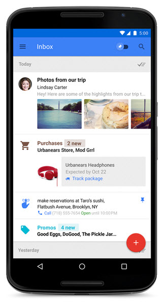 Google continues to place a huge emphasis on innovating around the email inbox, announcing a new email app simply called Inbox. This move follows the wider rollout of a native unsubscribe link, turning on images by default with image caching, introducing grid view, and launching Gmail Tabs—all in the last year and a half.
The Inbox app’s two most compelling elements are Bundles and Highlights. Bundles allows users to group emails together for viewing. That apparently also includes grouping emails—such as promotional emails—so that they only arrive once a week, for instance.
Highlights is Google’s new, highly disruptive spin on snippet or preview text. When appropriate, it will show images, not just text—and more importantly, it will show content that’s not actually in the email in some cases. For example, using Google’s search expertise, an email about a package delivery could show you the real-time status of that delivery, even if the email doesn’t contain that information. Given this change, we should probably start calling it snippet content or preview content, not text.
For a full discussion of what these features mean for email marketers…
>> Read the entire post on the Salesforce Marketing Cloud blog
Tweetables from Dreamforce 2014
Posted on October 20, 2014
 It was a great week at Dreamforce 2014 and I found plenty of great content to tweet about. In case you missed them, here are all the tidbits, factoids, and stats that I shared this week from the conference. You can find all the tweets from Dreamforce at #DF14.
Sears.ca overhauled cart abandonment email, making it a series, showing product abandoned, and adding product recommendations. #DF14 [Tweet]
Sears.ca overhauled cart abandonment email and increased opens by 2.7x and clicks 5.8x. #DF14 [Tweet]
Sears.ca sends browse abandonment email that highlights price drops of browsed product, along with related product recommendations. #DF14 [Tweet]
American Apparel is experimenting with collecting topic preferences on optin confirmation page. ~@_ajdelrosario [Tweet]
American Apparel’s welcome email generates nearly 3,000% ROI. ~@_ajdelrosario [Tweet]
American Apparel is working on launching a welcome email series. ~@_ajdelrosario #DF14 [Tweet]
American Apparel’s birthday email goes out to 14 regions in 8 languages. ~@_ajdelrosario #DF14 [Tweet]
American Apparel targeted customers that tend to buy between 2am and 5am with a “You are not dreaming” campaign. ~@_ajdelrosario #DF14 [Tweet]
75% of marketing budgets will go toward digital channels by 2019, according to Accenture. #DF14 [Tweet]
Journey management strategies can increase sales by 15%. #DF14 [Tweet]
Volvo Construction Equipment’s emails are segmented and personalized by industry. #DF14 [Tweet]
Two-thirds of Beyond the Rack’s revenue comes from their email program. #DF14 [Tweet]
The web is a dying technology. The future of Ecommerce is mobile. -George Colony of Forrester #DF14 [Tweet]
The Customer Insight (CI) officer is an emerging role focused on understanding customer data. -George Colony of Forrester #DF14 [Tweet]
18% of Americans have made a purchase from outside the country in the past 3 months. -Forrester #DF14 [Tweet]
Hillary Clinton talking about Too Small To Fail program that helps parents boost their kids’ language skills. #DF14 [Tweet]
Hillary Clinton supports net neutrality and a free and open internet. #DF14 [Tweet]
Sprouts grocery stores used their social media word cloud to inspire their ad messaging. #DF14 [Tweet]
Sprouts grocery stores focuses on audience engagement (comments, retweets, etc.) and not on audience size. #DF14 [Tweet]
Fred Meyer Jewelers sends a jewelry care email 6 months post-purchase asking customers to come in for product cleaning & inspection. #DF14 [Tweet]
RT @CKunplugged: “@TeamHeller: “90% of world’s data created in last 2 years!” – @benioff #DF14 “…challenge is to make it actionable [Tweet]
Boom! I love Bryan Wade’s passion for the Marketing Cloud product. You can’t succeed without passion. #DF14 [Tweet]
Live Nation tracks over 4,000 customer attributes, using those data points for targeted marketing. #DF14 [Tweet]
McDonalds creates content at the national brand level that their 14,500 local store social media managers can use. #DF14 [Tweet]
Journey Builder is the Salesforce Marketing Cloud’s fastest growing product ever. #DF14 [Tweet]
RT @drewbeechler: “The more you conform, the more of a commodity you are.” @lazerow #df14 #weirdforce [Tweet]
RT @Dreamforce: The #DF14 community has donated 771K meals. Let’s get to the finish line! Donate at http://sforce.co/1nm7lbS or text dfgives to 50555. [Tweet]
RT @lvojvodich: “I want customer service so good that it’s marketing. I want marketing so good that it’s customer service.” @smccorckle at #DF14 [Tweet]
Most tech companies over 20 years old will likely break up in the next 5 years to better compete. ~@pmarca #DF14 [Tweet]
There is no reason that this new generation of tech companies can’t be larger than the previous generation’s. ~@pmarca #DF14 [Tweet]
Apple Pay and Bitcoin will disrupt the financial services industry over the next few years. ~@pmarca #DF14 [Tweet]
Cable TV’s business model is a “melting ice cube.” ~@pmarca #DF14 [Tweet]
Every division at P&G has a head of design. #DF14 [Tweet]
P&G takes their designers on field trips to visit glass blowers, puppet-makers, etc. to keep them inspired. #DF14 [Tweet]
Responsive email design forces you to focus your content and cut out distractions. That in and of itself can boost results. ~@krudz #DF14 [Tweet]
Use call center feedback and Yelp reviews to identify friction points and then address those proactively via email messaging. ~@krudz #DF14 [Tweet]
Your emails are just not going to look the same everywhere. We have to get over that. ~@krudz #DF14 [Tweet]
As an intermediate step toward fully responsive design, consider making just your header & footer responsive. ~@krudz #DF14 [Tweet]
RT @arvindraman: Really great session by @chadswhite on email lifecycle. Nice to take a step back & take a holistic look (esp being on the tech side) #df14 [Tweet]
.@parkerharris says that he thinks of all technology as being design/UX led. [Tweet]
If you want a job in tech, just say you’re a data scientist or a really good designer and you’ll get a job instantly. ~@parkerharris #DF14 [Tweet]
“The business of business is business” was appropriate for 20th century. No longer. Companies have to give back. ~@Benioff #DF14 [Tweet]
Journey Builder needs to be integrated into sales, into service. All of these have journeys too. ~@Benioff #DF14 [Tweet]
Farewell @Dreamforce #DF14. See you September 2015! [Tweet]
Holiday Predictions: This Year’s Email Marketing Twists
Posted on October 8, 2014
![]() In my latest Email Insider column for MediaPost, I share my thoughts on how the upcoming email marketing holiday season will be different from last year’s, including that…
In my latest Email Insider column for MediaPost, I share my thoughts on how the upcoming email marketing holiday season will be different from last year’s, including that…
- Adoption of mobile-friendly email designs will hit 70%
- Free gift card with purchase will join free shipping as a hot promotion
- Black Friday deals will be more prominent on Thanksgiving Eve
- Cyber Monday deals will expand into Cyber Week deals ending Thursday
- Green Monday will start to be better branded and promoted by name
- Last Sleigh Day will be big because of its optimal positioning on the Monday before Christmas
>> Read my entire column on MediaPost.com.
Win a Copy of Email Marketing Rules – Share Your Favorite Email Marketing Best Practice
Posted on October 7, 2014
Smart Insights wants to know: Which email marketing best practice have you found most effective for your company or clients?
Share your best tip here for a chance to win one of three copies of my book, Email Marketing Rules. The contest ends Friday, Oct. 17, and entries that include testing results and valuable details will be favored.
>> Get all the details and share your favorite best practice
September Review & October Preview for the 2014 Email Marketing Holiday Calendar
Posted on October 6, 2014
 Every month through January, we’ll be reviewing our predictions from the 2014 Email Marketing Holiday Calendar for the previous month and discussing what to expect this month in terms of holiday messaging trends.
For September, we predicted that major retailers would send their active subscribers 18 promotional emails. That prediction was very close to the actual, as our panel of more than 100 retailers sent their subscribers 17.7 emails on average last month.
In October, we’re expecting retailers to again send their active subscribers around 19 promotional emails each. The amount of holiday messaging will rise, reaching a moderate level before ramping up significantly during November.
>> Read the entire post on the ExactTarget Blog
The Last Word on September 2014
Posted on October 3, 2014
 A roundup of email marketing articles, posts, tweets and examples you might have missed last month…
Must-read articles, posts & whitepapers
How Gmail’s unsubscribe button really affects email marketers (Campaign Monitor)
Email marketing innovations – what’s new? (SmartInsights.com)
Stop Losing Subscribers: Slash Unsub Rates With Opt-Down Options (MediaPost)
Energize Holiday Emails with Site Search Data (Only Influencers)
Consumers: Emails With Discounts Heavily Influence Purchase Decisions (MarketingCharts.com)
Email Trust – OTA Unsub Best Practices Audit (Privacology)
Insightful & entertaining tweets
@chadmumm: Obligatory smartwatch notifications http://t.co/KAT95CbJ6Q
@rem: HTML emails ftw http://t.co/CEFd5vO4O1
@akingkiwi: Yaaarrrr there be an Easter Egg in this @ActionRocket email! Happy talk like a pirate day me hearties http://t.co/sYdIMtA8Qc
@LorenMcDonald: Email marketers: Try to change preferences, email address & unsubscribe from your own emails yep, you didn’t realize it was that bad
Great additions to the Swipe File pinboards
Nike acknowledges runner’s milestone to spur purchase >> View the pin
American Apparel celebrates subscribers’ half-birthdays >> View the pin
Starbucks announces new app with clean, S-curve email design >> View the pin
CrashPlan’s email plans for image blocking >> View the pin
Noteworthy subject lines
Ikea, 9/30 — Explore our guide for a guest-ready home
Sony, 9/28 — Sony Holiday Catalog: Reserve by 10/4 | Holidays Are Just Around the Corner
Hanna Andersson, 9/22 — Ready? NEW arrivals + first look at holiday!
Tiny Prints, 9/14 — Introducing Our 2014 Holiday Collection
Toys “R” Us, 9/14 — It’s Here! Our 2014 Hot Toy List
The Shopping Channel, 9/25 — Christmas in September
Sephora, 9/17 — These will go long before the holidays
Michaels, 9/30 — Trick Out Your Pumpkin
Zulily, 9/6 — Because everybody needs a cape. Superhero costumes, Kidorable Ninja, COCO Jumbo & more
Hanna Andersson, 9/5 — Halloween hannas + NEW sleepwear markdowns!
Babies “R” Us, 9/6 — We’re Your Disney Baby Costume Destination for Halloween
Petco, 9/29 — Shop spooky savings with 20% off our Halloween BOOtique!
Home Depot, 9/25 — ☾ BOO! We Dare You to Open! ☾
Lego, 9/25 — Spooky fun is here with these Halloween builds.
MAC Cosmetics, 9/30 — M•A•C Rocky Horror – It’s a Scream! Plus Free Overnight Shipping.
Clinique, 9/26 — Chad, help Clinique fight breast cancer.
SkyMall, 9/7 — Happy Grandparents’ Day from SkyMall!
FansEdge, 9/4 — It’s Week Shop NFL & NCAA Gear
SkyMall, 9/4 — Are You Ready for Football Season?
Barneys New York, 9/26 — Sports Center: Shop Athletic Style for Men
Walgreens, 9/21 — Are you ready for flu season? Take the pledge and get the shot.
Banana Republic, 9/26 — 5 things you need for fall.
Sears, 9/27 — Before it’s too late! Give your lawn some lovin’ …
Dunkin’ Donuts, 9/4 — Almond Milk is now available in your favorite DD beverages
Gucci, 9/30 — Introducing Gucci Cosmetics
West Elm, 9/20 — Wake up. Grab coffee. Shop 10 sales…
Pier 1 Imports, 9/7 — Yes, you deserve this bedroom.
Wayfair, 9/4 — Say hello to your new roommates: Monet and van Gogh
Lululemon, 9/30 — made with frickin’ laser beams
Ann Taylor, 9/13 — The Daily Edit. Deal #3 is ____________
Urban Outfitters, 9/5 — ^ Side Zip Hoodies Now ^
Anthropologie, 9/4 — Our top-drawer bottoms.
Neiman Marcus, 9/20 — NEW Stuart Weitzman BYOB #OnlyatNM
Express, 9/27 — It’s all happening on Instagram…
The Container Store, 9/12 — What products do our employees love?
Banana Republic, 9/2 — You’re still wearing white, right?
Kate Spade, 9/23 — coat? check!
SkyMall, 9/28 — Jeter’s Final Farewell
New posts on EmailMarketingRules.com
Tweetables from Connections 2014
Email Subscriber Lifecycle Strategies from the Swipe File
Getting Email Out of the Friend Zone
Acknowledgments & Quotes: Who to Follow and What to Read
Crowd Favorites from the Swipe File: August 2014
The Email Marketing Rules for Measuring Success
August Review & September Preview for the 2014 Email Marketing Holiday Calendar
Q&A with Internet Retailer: My New Book, the Holiday Season, Mobile, and More
Fall Edition of the Email Marketer’s Holiday Planning Checklist
Posted on October 1, 2014
![]() Hopefully you spent your summer doing some big picture strategic planning for the holiday season. Now that we’re into October, it’s time to get more serious and more focused to the execution of holiday campaigns.
Hopefully you spent your summer doing some big picture strategic planning for the holiday season. Now that we’re into October, it’s time to get more serious and more focused to the execution of holiday campaigns.
In the second of my 3-part Holiday Planning Checklist for Internet Retailer Magazine, I advise retailers to:
- Meet with your web and data teams
- Plan on wrapping up all website and other infrastructure improvements
- Perfect cross-channel insight sharing
- Launch or improve your wish list functionality
- Clean up your email list
- Develop a response plan should you get blacklisted
- Create a landing page template
- Draft an apology email
- Start planning and designing your holiday email template
- Re-skin your welcome emails for the holiday season
- Prepare your gift guides
- Optimize your transactional emails, including e-receipts
- Plan a progressive profiling campaign for mid-November
For the full details on each of these recommendations, which include a lot of tips and stats just for retailers…
>> Read the full article on InternetRetailer.com.
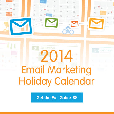
And for even more holiday planning advice, check out our 2014 Email Marketing Holiday Calendar.
Tweetables from Connections 2014
Posted on September 25, 2014
 It was a great week at Connections and I found plenty of great content to tweet about. In case you missed them, here are all the tidbits, factoids, and stats that I shared this week from the conference. You can find all the tweets from Connections at #CNX14.
Watch the Digital Marketing Event of the Year from your desk! Sign up for #CNX14 Livestream! http://extg.co/1CSjIRO [Tweet]
Bringing together known customer data and anonymous customer data has been a big challenge. -Matt Smith of Best Buy #CNX14 [Tweet]
By paying attention to where customers are in the lifecycle of a product like smartphones, we can send relevant messages. -Best Buy #CNX14 [Tweet]
20% of donations to DonorsChoose.org come from email marketing. #CNX14 [Tweet]
The majority of @ExactTarget customers are using the Marketing Cloud for more than one channel now. #CNX14 [Tweet]
LiveNation tracks 4,000 attributes for each of their customers. #CNX14 [Tweet]
Thanks to everyone who attended my #CNX14 session. You can find the slides and resource list here >> http://www.emailmarketingrules.com/email-subscriber-lifecycle-strategies-swipe-file/ [Tweet]
RT @lauramaggie: Full, front & back, single-spaced page of notes coming out of @chadswhite’s Email Lifecycle Strategies #ohthetakeaways! #CNX14 [Tweet]
Lots of small, real-time interactions add up to a long, detailed customer journey. -Gabriel Stricker of Twitter #CNX14 [Tweet]
Innovation is now the mantle of every department within a company–marketing, accounting, legal… -Gabriel Stricker of Twitter [Tweet]
The ability to micro-target has totally changed how we do business. -Beth Comstock of GE #CNX14 [Tweet]
Mindshare before market share. -Beth Comstock of GE #CNX14 [Tweet]
Geeks are more “artists” than artists are. -@iamwill #CNX14 [Tweet]
Awesome! @thescript and @iamwill rocking out together at #CNX14 http://t.co/ntqANkR32c [Tweet]
RT @jkrohrs: Watch the #CNX14 CMO Conversations panel here: http://t.co/hpGROC9m71. Great insights from @gabrielstricker @bethcomstock & @nickbesbeas. [Tweet]
Simon malls trades free wifi access in exchange for an email opt-in. #CNX14 [Tweet]
Sirius XM radio manages hundreds of Facebook pages and Twitter accounts. #CNX14 [Tweet]
Mobile is where most of our customer interactions are taking place. -Mark Highland of Gannett #CNX14 [Tweet]
We are not loyal to a company because of a program. -Maggie Lang of Kimpton Hotels [Tweet]
Technology needs to map up to a culture. -Maggie Lang of Kimpton Hotels #CNX14 [Tweet]
McDonald’s has 14,500 Facebook pages–one for each local store to address local customers. #CNX14 [Tweet]
We have to connect and interact with our customers at the local level, not just the brand level. -David Martinelli of McDonald’s #CNX14 [Tweet]
They are not trying to read our emails. They are trying to delete them. We want to prevent that through relevance. -@JonPowell31 #CNX14 [Tweet]
Difficulty and length are impediments to action but are not as bad as unnecessary difficulty and length. -@JonPowell31 #CNX14 [Tweet]
RT @joshkimber: @lvojvodich @bradgressel @chadswhite @LudoRaedts @alexandani The Top 15 People at #CX14 and you’re one of them. http://j.mp/1xfW1l2 [Tweet]
Over the past year, @ExactTarget customers have sent 237 billion emails, including 8.5 billion triggered emails. #CNX14 [Tweet]
To get our Spark newsletter, send a blank email to spark@sendmespark.com. New functionally announced at #CNX14 [Tweet]
This new “blank email opt-in” functionality is a cool new flavor of confirmed opt-in. #CNX14 [Tweet]
Hulu uses behavior analytics to determine when is the best time to approach users about upgrading to Hulu Plus. #CNX14 [Tweet]
Real-time data collection is absolutely critical to powering personalization and triggered emails. -Dasha Gastol of Diesel #CNX14 [Tweet]
Sales conversions increased 15% to 25% by adding personalized recommendations to cart abandonment emails. -Dasha Gastol of Diesel #CNX14 [Tweet]
Lee’s number one source of subscribers is the lightbox signup form on their website. #CNX14 [Tweet]
The email signup confirmation page on Lee.com asks new subscribers to take a style quiz for profiling purposes. #CNX14 [Tweet]
Dollar Bank’s welcome emails have 60%+ open rates versus roughly 30% for their other emails. #CNX14 [Tweet]
Lee’s emails with promotional CTAs do better in morning and those with social and other non-promo CTAs do better in evening. #CNX14 [Tweet]
Lee sends a birthday email, a half-birthday email, and a birthday wish list email a few weeks before a b-day. -@EmailGirl #CNX14 [Tweet]
Lee gives subscribers the opportunity to opt up to receive extra special emails during the holiday season. -@EmailGirl #CNX14 [Tweet]
RT @mikeramo: ‘OPT UP’ I have heard this term 100 this week and plan to take it home and use it Thanks @chadswhite @andreasmith77 @EmailGirl #CNX14 [Tweet]
Webroot ran into deliverability issues because of a free trial offer that was attracting poor quality addresses. #CNX14 [Tweet]
Webroot uses different sending strategies for inactives at different ISPs. #CNX14 [Tweet]
RT @NancyWeaver: “@jkrohrs: #CNX14 friends, get seats early for @realjohngreen’s 9am keynote. Stellar. #dftba http://t.co/SaoYcxbfAQ” Can’t wait! [Tweet]
Great catching up with @swerdtoyourmom @jacaldwell @jcohen808 @mostew @DerekBHarding at #CNX14 [Tweet]
Cedar Point theme parks have 3 journeys they focus on: pre-visit, time in park, and post-visit. #CNX14 [Tweet]
You don’t become authentic. You become yourself over and over again. -John Green #CNX14 [Tweet]
Sometimes the really important metrics aren’t the apparent ones. -John Green #CNX14 [Tweet]
Feeling good about myself. My 1st book outsold John Green’s. “Email Marketing Rules” the Movie? #CNX14 [Tweet]
What’s bad for your community is ways bad for your business. -John Green #CNX14 [Tweet]
The problem with selling a long-term relationship is you don’t have it anymore. -John Green about monetizing relationships #CNX14 [Tweet]
If you allow a good community to guide you, they will show you yourself again and again. -John Green #CNX14 [Tweet]
About 27% of time spent on mobile devices is spent on Facebook or Instagram. #CNX14 [Tweet]
RT @kyleplacy: Download all the #CNX14 breakout session slides on @Slideshare – http://www.slideshare.net/exacttarget [Tweet]
We like to think about the next best action, because it is not always the next best offer. -Rob Davis of Accenture #CNX14 [Tweet]
It used to take Xcel Energy 4-6 weeks to create an audience list for an email send. #CNX14 [Tweet]
40% of Xcel Energy’s customers have made a selection in their preference center. #CNX14 [Tweet]
RT @swerdtoyourmom: Famous #emailmarketing author, @chadswhite meeting & greeting one of his biggest fans, @jacaldwell #CNX14 http://t.co/CSwdv3B1FK [Tweet]
Loving the dancers/cameramen here at #CNX14 [Tweet]
If you have to force yourself to tweet, then you shouldn’t be tweeting. -@mindykaling #CNX14 [Tweet]
When you are trying to come up, it is all about putting in the time. -@mindykaling #CNX14 [Tweet]
It has been a great #CNX14. See everyone at #CNX15 in NYC June 15-17, 2015. [Tweet]

Welcome! Email Marketing Rules is your guide to understanding the best practices of this complex, often misunderstood channel as you craft the best executions for your brand. Every week, we’ll explore strategies and tactics, discuss tips and inspiration, and dig into industry news and trends.
Chad S. White
GVP of CRM Strategy
Zeta Global
Author of Email Marketing Rules and nearly 4,000 articles about digital and email marketing
![]()

![]()