 Email Marketing Rules
Infographic: The Growing Adoption of Mobile-Friendly Email Design
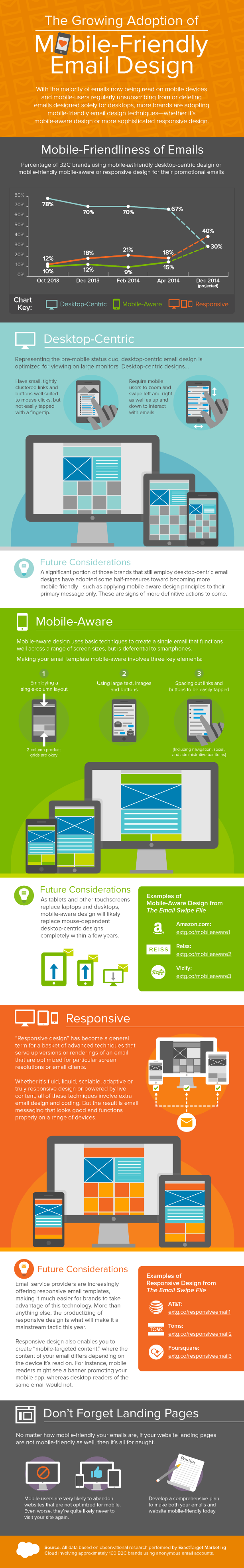
We’ve been tracking the mobile-friendliness of the promotional emails sent by a group of nearly 160 B2C brands since October of last year. We saw a big bump in the adoption of mobile-friendly email design during the holiday season and this summer we expect major progress, followed by another jump in adoption as we approach the holiday season again.
Beyond detailing the adoption rates we’ve observed, this infographic explains the difference between desktop-centric design, mobile-aware design, and responsive design—and the future outlook for each of them. It also includes links to examples of mobile-aware design from Amazon.com, Reiss, and Vizify, and examples of responsive design from AT&T, Toms, and Foursquare from the Email Swipe File on Pinterest.

Welcome! Email Marketing Rules is your guide to understanding the best practices of this complex, often misunderstood channel as you craft the best executions for your brand. Every week, we’ll explore strategies and tactics, discuss tips and inspiration, and dig into industry news and trends.
Chad S. White
Head of Research
Oracle Digital Experience Agency
Author of Email Marketing Rules and nearly 4,000 articles about digital and email marketing


Features