 Email Marketing Rules
Email Signup Failures at Crisis Levels
Posted on April 11, 2013
Opt-in failures are costing brands high-quality subscribers and dampening their list growth. More than 15% of homepage and site registration email signup processes resulted in failures, according to ExactTarget research involving more than 160 B2C brands, including retailers, restaurants, manufacturers, travel and hospitality, and nonprofits. This is a worsening from several years ago when signup failures hovered around an already-too-high 12%.
 These failures are particularly costly because people who signup via your website are your most valuable subscribers. So losing these has an outsized effect on your email program’s ROI.
While it’s not clear why many of the signups failed, some program characteristics coincided with higher and lower failure rates:
Using confirmed opt-in (COI): Brands that use COI, where a subscriber has to click on a link in a signup confirmation email to complete the signup process, were more likely to have their subscriptions fail. Nearly 27% of the brands using COI suffered signup failures.
For example, GoDaddy’s COI failed because every time you confirmed the signup by clicking on the link in the signup confirmation request email, it sent you another signup confirmation request email and bounced you back to the page notifying you that you have to confirm your subscription by clicking on the link in the email they just sent you. Simply put, it created an infinite loop that you could never break out of.
Sending a welcome email: Signups were less likely to fail if a brand was able to successfully deliver a welcome email. Only 9% of brands saw their signups fail after delivering a welcome email. (See More Brands Sending Welcome Emails, But Opportunities Remain.)
Sending a welcome email series: Not a single brand that delivered a welcome email series saw their signup fail subsequently. (See Quarter of B2C Marketers Send a Welcome Email Series.) This is likely an indication of greater sophistication and therefore better controls.
The high level of signup failures speaks to a need to do more subscription process audits, which have become more complex in recent years.
Platform proliferation means there are now more devices, more operating systems and more browsers to check since they all don’t work the same together. For instance, Discovery Store’s signup form encountered a fatal error when using Firefox on Windows 7, but worked fine when using Internet Explorer.
Acquisition source proliferation means there are now more channels to check. For instance, is your text-to-subscribe working properly? Does the email signup form on your Facebook page work? Does the email signup during checkout on your mobile app work? Tracking your subscribers by acquisition source can help you uncover signup issues, in addition to helping you make decisions about subscriber value by acquisition source.
If you haven’t done an acquisition source audit recently, it’s probably time to do one as you could be unknowingly losing valuable subscribers.
More Fields, Fewer Subscribers
Posted on March 28, 2013
Companies spend a lot of time and money optimizing their online checkout pages because they know that checkout abandonment is money lost. The same is true of email subscription forms—higher abandonment means slower list growth and therefore less money generated by the email program. Yet, brands don’t appear to be giving these forms nearly the same level of attention.
 After signing up for emails from more than 160 B2C brands, I saw many behaviors that are reducing signup completions, including:
Forcing consumers to register in order to receive emails. An email relationship is an incremental one. It’s like a conversation—You don’t blurt everything out at once in a huge monologue, but rather reveal a little at a time over the course of the back-and-forth of the conversation.
It starts with them sharing their email address, and then if they enjoy what you say after that then they give you more information through email and browse behavior, via progressive profiling, and by checking out or registering.
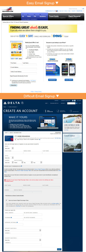
For example, Southwest Airlines eases into the email relationship, asking for relatively little information. On the other hand, Delta Air Lines requires consumers to register with their site in order to receive emails. The “Basic Information” portion of their registration form alone has 25 fields and includes TSA warnings that get people thinking about airport hassles instead of saving on a fun getaway.
Very few retailers still require consumers to register in order to sign up for promotional emails, but many non-retailers still require registration.
Asking for too much information, especially additional contact information. Even if they’re not asking you to register with the site and set up a user name, password and security questions, some brands are just one step shy of that and ask for mailing addresses, phone numbers and other details that have absolutely nothing to do with fulfilling an email subscription.
Not only do more fields lower completion rates, but consumers are suspicious of brands who ask additional points of contact like mailing addresses, which lowers completion rates even more, according to research. Especially if you sell online, there’s no reason to try to grab tons of information upfront, because if your emails are effective then your subscribers will be buying from you and you’ll collect mailing addresses and phone numbers during checkout.
Most retailers have figured this out, with many only asking for a consumer’s email address in order to opt in. Some also ask for a zip code to do segmentation or personalization, and some ask for a first name for personalization. But many non-retailers are well behind the curve when it comes to keeping email opt-ins simple and then using progressive profiling or checkouts to collect additional information.
Making consumers accept content they don’t want to get the content they do want. You would like for consumers to be interested in all of your brands, and you’d certainly like to leverage their interest in one of your brands to get them interested in your others. But you have to tread softly.
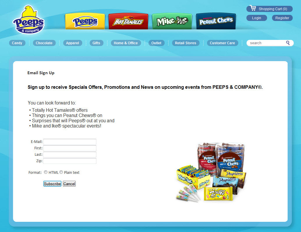
For instance, Peeps and Company doesn’t give their subscribers a choice as to which brands they get content from. If you want to get Peeps updates, you also have to get updates about Peanut Chews, Hot Tamales, and Mike & Ike. Let your subscribers choose which products they’re interested in and make that the focus of your message, and use secondary messaging to occasionally promote your other brands.
All three of these practices reduce email signups. What’s more, our research only looked at homepage email opt-ins, which are generally among the most productive you can get. So the opportunity cost of long and inefficient forms there is higher than average.
1 in 10 B2C Marketers Using Lightboxes for Email Signups
Posted on March 19, 2013
More prominent email signup forms and links perform better. In-your-face lightboxes take this logic to the far end of spectrum and are enjoying growing popularity, particularly among retailers.
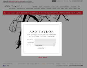
Unlikely the justly vilified pop-up and pop-under, lightboxes or popovers don’t launch a new window. They are a part of the page you’re already viewing and require you to complete the form or close the lightbox to regain access to the rest of the webpage, which is usually greyed out in the background, as you can see in this Ann Taylor example.
Ten percent of marketers are using lightboxes for email signups, according to ExactTarget research involving more than 160 B2C brands, including retailers, restaurants, manufacturers, travel and hospitality, and nonprofits. With more than 13% of retailers using an email signup lightbox, they are more than three times more likely to use this tactic than non-retailers. A few years ago hardly any marketers were using lightboxes.
The risk with lightboxes is that they are interruptive and therefore potentially annoying if they pop up too often. To minimize this risk, most brands set limits on how often lightboxes can be triggered for a particular visitor and some only trigger them for first-time visitors. Some also delay the launch of the lightbox for five or more seconds to give visitors a chance to start engaging with the site.
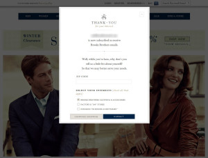
While all the talk lately has been about lightboxes for email signups, roughly as many marketers use them for post-signup confirmation instead. This is particularly true of brands like Brooks Brothers that have an email signup form in the footer of all their webpages. Their post-signup lightbox thanks the new subscriber for signing up and also asks for some additional information and preferences to improve their email experience.

Welcome! Email Marketing Rules is your guide to understanding the best practices of this complex, often misunderstood channel as you craft the best executions for your brand. Every week, we’ll explore strategies and tactics, discuss tips and inspiration, and dig into industry news and trends.
Chad S. White
Head of Research
Oracle Digital Experience Agency
Author of Email Marketing Rules and nearly 4,000 articles about digital and email marketing
![]()

![]()

Features