 Email Marketing Rules
4 Tips on How to Avoid These 8 Embarrassing Preview Text Mistakes
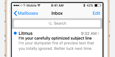 Preview text is the third leg of the inbox stool, and a great many brands are delivering some rickety, off-balance inbox experiences because they’re not paying enough attention to their preview text.
In this SlideShare deck, we highlight eight preview text mistakes that are undermining customer experiences in the inbox, sharing real-world examples of each one:
- Having Unoptimized ALT Text Pulled into Your Preview Text
- Having Your Code Show
- Forgetting to Replace Preheader Placeholder Text
- Using Unsupported Characters
- Having Broken Personalization
- Having Your Preview Text Get Truncated Awkwardly
- Having Jarringly Poor Subject Line-Preview Text Alignment
- Not Even Trying to Optimize Your Preview Text
We also share a 4-point action list that can help you ensure that your brand always makes a great impression in the inbox and delivers a clear, distraction-free message.
>> Read the post and view the slides on the Litmus blog

Welcome! Email Marketing Rules is your guide to understanding the best practices of this complex, often misunderstood channel as you craft the best executions for your brand. Every week, we’ll explore strategies and tactics, discuss tips and inspiration, and dig into industry news and trends.
Chad S. White
Head of Research
Oracle Digital Experience Agency
Author of Email Marketing Rules and nearly 4,000 articles about digital and email marketing
![]()

![]()

Features